
8-bit microcomputer graphics were, compared to the graphics cards and chips we mostly use today, pretty limited. While machines like the Commodore 64 and Atari 800 allowed for a fully programmable display, not all devices of the age provided for that.
One solution was what I am told is now called semigraphics, which means using generic characters that are pre-defined by the system in combination with each other, piecing together larger images from symbolic building blocks.
ASCII Art, that fading art form created to make imagines on terminal displays, is a form of semigraphic. The IBM PC character set supported semigraphics mostly through its famous Code Page 437, which provided a variety of line-drawing characters , but looking at it it’s evident that it wasn’t intended for general graphic use.
Different platforms from the time varied widely in their support for graphic characters. Let’s take a quick look at what the options were.
Apple
The base Apple II had a very limited character set:
The Apple II’s character offers little opportunity for graphic use. Of course the Apple II is a miracle through and through for being designed almost entirely by one person, Steve Wozniak, and that includes its character set. Note that it doesn’t neglect reverse video, and even has hardware support for flashing characters. Still though, not much you can do with it other than repurpose punctuation and letters.
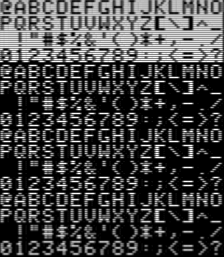
PETSCII

The PET and successors, by contrast have an excellent character set for makeshift graphics. The image above is of the Commodore 64 version, but the same graphics are used on old PETs, the VIC-20, the Commodore 128, and even the TED-based machines, the Plus-4 and Commodore 16.
While they’re not reflected in the above image, the whole character set can be reversed too. These machines reverse characters by, simply, duplicating the whole set in ROM as negative images.
PETSCII contains:
- Four playing card suit glyphs
- A decent set of line-drawing characters, with all intersections both sharp-edged and curved corners
- Diagonal slopes, diagonal lines and crossed diagonals
- Horizontal and vertical lines at different places in the character cells
- Frame corners, which combined with the lines can make decent rectangles
- Horizontal and vertical bars at several different widths
- Half-tone checkerboards and half-character checkerboards (on PET systems these have a single-pixel grain, but on later machines the checkerboard squares are 2×2 blocks)
- 4×4 blocks in enough combinations that, combined with their reverse versions, can be used to approximate a 80×50 pixel display with plain characters
- Symbols for English pound and Pi
PETSCII is one of the most versatile character sets from the time, and you can do a ton with it with some thought and ingenuity. There used to be a Twitter account (in the days before the Muskening) that posted images of robots made out of PETSCII characters. And because the character set is included in ROM, one doesn’t have to create their own character graphics, using up 8K of system RAM to hold them, to have rudimentary graphics. (In fact, the original PET didn’t even support redefining the character set, so PETSCII was all you got.)
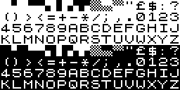
ATASCII

Did Atari consciously follow the naming of PETSCII, with their own self-branded ATASCII? Both are riffing off of ASCII, which stands for American Standard Code for Information Interchange. So I guess PETSCII, going by Commodore’s own claimed meaning for PET, means “Personal Electronic Transactor Standard Code for Information Interchange,” which is pretty terrible. But the ATA in ATASCII makes even less sense, since ATA obviously is just the first three letters in Atari.
While it has nowhere near the sheer number of graphic characters that PETSCII has, it had a decent number, including line drawing, slopes and diagonal lines and playing card suits. Of particular note is that the Clubs symbol has the same hole in its middle that it does in PETSCII.
TRS-80

Wikipedia doesn’t offer a screenshot chart of all the symbols of the TRS-80 set, but it does an HTML Table display, which the above is excerpted from. The only graphic characters it has are these off 2×3 cells, which are like the 2×2 blocks in the Commodore set but with an extra row. This gives its screen slightly finer resolution.
The TRS-80 had fairly basic graphics, it seems: those characters appear to have been it as far as graphics goes. The page I saw that described its capabilities even had a name for those blocks: squots. I think that’s a perfectly fine name for these kinds of boxes, whether it’s on a TRS-80, Commodore 64 or other machine.
Sinclair ZX-81
The ZX-81 had a very limited character set. While it has checkerboard and 4×4 block characters, their inclusion comes at the cost of an apostrophe, an at-sign, and even an exclamation point.
The following Spectrum removed the checkerboards, but added the exclamation point and apostrophe, as well as a lowercase alphabet. Still no @ though.
DOS Code Page 437
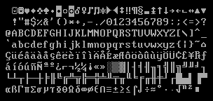
This is the one that most of you probably already know. It has its own version of squots, but they’re incomplete: it doesn’t have quarter-box or squot-grained checkerboard characters, tlhough it does have three forms of half-tone, a rather extra assortment of double-lined box characters, playing card suit glyphs, and a number of unusual characters up above that will be very familiar to anyone who played PC Rogue.
DOS Code Page 437 was in many ways the end of the venerable tradition of character set graphics. Neither the Atari ST nor Amiga had much use for general purpose character graphics, instead choosing to use their sets’ spare capacity for international characters, a noble offering, but less useful for graphic use.
It is worth noting some of the characters in the ST’s set, though:
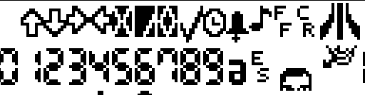
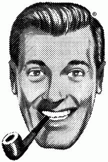
Some miscellaneous glyphs like arrows, an X mark and checkbox, a bell and musical note, the Atari logo in two characters, a bunch of digital readout numbers, and four characters that seem to form a face. Here, I’ll piece it together for you:

Who might this handsome person be? It’s a little hard to make out at this scale, but it’s intended to be a pixel-art representation of “Bob” Dobbs, icon and symbol of the Church of the Subgenius!
It’s not a good set of squots, but it’s not bad.
I’m partial to ATASCII (it looks fantastic on a TV) but they blundered with one aspect. It has quadrant characters that could be used for low-resolution bitmaps, just like PETSCII, except it is missing one of the needed characters ($BF in your PETSCII image).
Also, something needs to be clarified. While the Apple character set is iconic, Woz did not design it. He selected an off-the-shelf character generator ROM for the Apple II, the Signetics 2513. Don Lancaster did as well for his TV Typewriter design from 1973. Woz had built something similar with the same chip, which became the basis for the Apple I video circuit. Apple adapted and extended the character set for the custom video ROMs used in their later computers, but they all feature that same 64-character Signetics 2513 design as their base.
Tandy’s Color Comouter 1/2/3 also has a semigraphics characters set. It’s similar to TRS-80 but only 2×2 instead of 2×3. CoCo 1 & 2 also had some interesting semigraphics modes courtesy of the MC6847 VDG chips that could display half of one character on the top and half of another on the bottom! The CoCo 3, reimplementing much but not all of the 6847 features in an ASIC, lost those features.