People familiar with MS-DOS should be right at home, although some commands are different. (That’s because MS-DOS changed them; it was originally made as a CP/M clone.) One major difference is the absence, in this version, of disk directories. Instead there were up to 16 numbered “user areas,” each its own individual region on the disk, kept separate from the others. CP/M was an amazingly compact system, a single floppy disk could host a half-dozen compilers and have room to spare.
#2: Speeding Up PETSCII
Commodore BASIC was notoriously slow, but also feature-poor. A version of the same Microsoft BASIC that was co-written by Bill Gates himself, and was later ported to MS-DOS as QuickBasic. This page is a collection of different ways to speed up printing PETSCII characters, covering several optimization techniques, one of them, avoiding IF statements, being non-obvious.
Some weeks ago I linked to a Wolfenstein 3D-like shooter by jimo9757 with a rendering engine implemented entirely in PETSCII, the only kind of graphics a Commodore PET, their first computer, was capable of producing. It was pretty shocking to see it in action, even if the best-looking version of it was the one made for a Commodore 64.
Well, here’s another video shenanigan along those lines, a platformer, one styled much like Super Mario Bros., also implemented with PETSCII graphics, and also from jimo9757. First the PET version (15 minutes, all eight levels), then the one made for the Commander X16 (3 minutes, a demonstration):
While other retro computer systems had their own distinctive fonts, including MS-DOS’s nigh-legendary code page 437, I think PETSCII is among the best. The PET could only do graphics at all using it, but it had quite a lot of foresight put into its character set. Among its characters are are seven different heights and widths of solid block, diagonal lines, balls, slopes, playing card symbols, box drawing borders of two different types, enough corners to make for decent low-res images, and reverse video versions of all of the above. Later 8-bit Commodore computers didn’t have to use PETSCII for graphics, but its presence made for a good baseline for amateur programmers without having to start messing around with POKEs (which every other kind of graphics on a C64 or VIC-20 required).
Read the subject line, and say to yourself quietly, “No way. What’s the catch?”
There is a catch, of course. There is an art to these kinds of hacks though, and it lies in finding the right catch. The catch that makes the hack possible at all, but seems the least like a cheat.
You can technically “run” Doom on a C64, if you actually run it on a Raspberry Pi plugged into it, that only uses the machine’s video hardware for output. That’s an egregious cheat; Raspberry Pis didn’t exist back in 1983 when the C64 was new.
There are speed-up cartridges for the C64, and you could even implement a co-processor to do much of the hard work of rendering the display for you. That’s also a cheat, although a bit less of one.
One could approach the problem from the other direction, diminishing the scope of the hack until it fits more comfortably in the computer’s capabilities. There are 3D corridor games on the C64; when I was a kid, a tape of software that a co-worker gave to my dad had one, called LABYRINTH, that was written in BASIC. But if it was truly the equal of Wolfenstein 3D it’d have revolutionized the gaming world. It wasn’t, and it didn’t. It generated one of those Wizardry-style mazes, sometimes called “blobbers,” where your perspective is fixed in the center of a grid-based maze. It wasn’t a shooter, it didn’t animate smoothly, and it was a pretty simple algorithm, simple enough that lots of games used it, especially RPGs.
What makes smoothly rendered graphics slow on a C64, indeed on pretty much all home computers at the time? It’s the necessity of using a bitmapped graphics mode. The math of deciding where the corridor vertices and lines go is within the machine’s capability, even at 1 mHz, but writing all those bytes into the C64’s 8K bitmap screen takes a huge amount of time.
It’s why few action games on the Commie used the bitmapped modes. Even if you used a hand-tuned machine code loop to write a single value to every byte in the bitmap, it’d be slow enough that you could visibly watch the screen fill up. If you wanted to actually vary those bytes, such as by rendering walls, it’d take much longer. Even filling the text screen takes so long that it’s difficult to do it in a single video frame, which is why games that feature NES-style full-screen scrolling on the C64 are impressive. (There are tricks to doing it; some of them quite bizarre. Let’s discuss those some other time.)
But you could do what jimo9757 did, and use text characters to simulate the rendering. In fact they did it one better, and used the PETSCII graphics characters for the display. The result is pretty striking! See for yourself in this demo (8 minutes):
Reserving a port of the screen for a status display is itself a bit of a cheat, that cuts down on the number of bytes that must be changed for each screen update, but it’s one that Wolfenstein 3D used too so let’s give it a pass. The walls only have horizontal lines for textures, but it’s not like the original’s were that worthy either. It’s certainly not 60 fps, it’s maybe 15 or 12, but it’s certainly still impressive to see those walls glide by smoothly on a machine with a 1 mHz 6502-class chip.
Since the game uses PETSCII for the maze, this engine can even work on the Commodore’s first home computer, the PET, whose character set was fixed in unchangeable mask ROM. Here’s video of the first-person shooter they made for the PET (3 minutes). I think the graphics, while many would call them primitive, have a fun style to them:
8-bit microcomputer graphics were, compared to the graphics cards and chips we mostly use today, pretty limited. While machines like the Commodore 64 and Atari 800 allowed for a fully programmable display, not all devices of the age provided for that.
One solution was what I am told is now called semigraphics, which means using generic characters that are pre-defined by the system in combination with each other, piecing together larger images from symbolic building blocks.
ASCII Art, that fading art form created to make imagines on terminal displays, is a form of semigraphic. The IBM PC character set supported semigraphics mostly through its famous Code Page 437, which provided a variety of line-drawing characters , but looking at it it’s evident that it wasn’t intended for general graphic use.
Different platforms from the time varied widely in their support for graphic characters. Let’s take a quick look at what the options were.
Apple
The base Apple II had a very limited character set:
Images in this post taken from Wikipedia
The Apple II’s character offers little opportunity for graphic use. Of course the Apple II is a miracle through and through for being designed almost entirely by one person, Steve Wozniak, and that includes its character set. Note that it doesn’t neglect reverse video, and even has hardware support for flashing characters. Still though, not much you can do with it other than repurpose punctuation and letters.
PETSCII
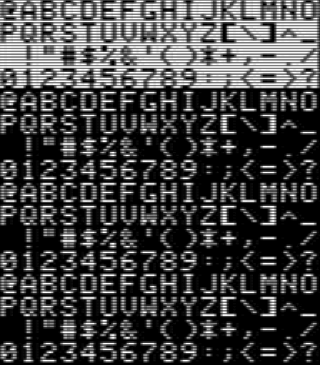
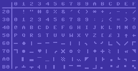
The PET and successors, by contrast have an excellent character set for makeshift graphics. The image above is of the Commodore 64 version, but the same graphics are used on old PETs, the VIC-20, the Commodore 128, and even the TED-based machines, the Plus-4 and Commodore 16.
While they’re not reflected in the above image, the whole character set can be reversed too. These machines reverse characters by, simply, duplicating the whole set in ROM as negative images.
PETSCII contains:
Four playing card suit glyphs
A decent set of line-drawing characters, with all intersections both sharp-edged and curved corners
Diagonal slopes, diagonal lines and crossed diagonals
Horizontal and vertical lines at different places in the character cells
Frame corners, which combined with the lines can make decent rectangles
Horizontal and vertical bars at several different widths
Half-tone checkerboards and half-character checkerboards (on PET systems these have a single-pixel grain, but on later machines the checkerboard squares are 2×2 blocks)
4×4 blocks in enough combinations that, combined with their reverse versions, can be used to approximate a 80×50 pixel display with plain characters
Symbols for English pound and Pi
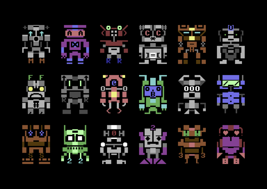
PETSCII is one of the most versatile character sets from the time, and you can do a ton with it with some thought and ingenuity. There used to be a Twitter account (in the days before the Muskening) that posted images of robots made out of PETSCII characters. And because the character set is included in ROM, one doesn’t have to create their own character graphics, using up 8K of system RAM to hold them, to have rudimentary graphics. (In fact, the original PET didn’t even support redefining the character set, so PETSCII was all you got.)
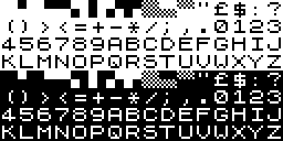
ATASCII
Did Atari consciously follow the naming of PETSCII, with their own self-branded ATASCII? Both are riffing off of ASCII, which stands for American Standard Code for Information Interchange. So I guess PETSCII, going by Commodore’s own claimed meaning for PET, means “Personal Electronic Transactor Standard Code for Information Interchange,” which is pretty terrible. But the ATA in ATASCII makes even less sense, since ATA obviously is just the first three letters in Atari.
While it has nowhere near the sheer number of graphic characters that PETSCII has, it had a decent number, including line drawing, slopes and diagonal lines and playing card suits. Of particular note is that the Clubs symbol has the same hole in its middle that it does in PETSCII.
TRS-80
Wikipedia doesn’t offer a screenshot chart of all the symbols of the TRS-80 set, but it does an HTML Table display, which the above is excerpted from. The only graphic characters it has are these off 2×3 cells, which are like the 2×2 blocks in the Commodore set but with an extra row. This gives its screen slightly finer resolution.
The TRS-80 had fairly basic graphics, it seems: those characters appear to have been it as far as graphics goes. The page I saw that described its capabilities even had a name for those blocks: squots. I think that’s a perfectly fine name for these kinds of boxes, whether it’s on a TRS-80, Commodore 64 or other machine.
Sinclair ZX-81
The ZX-81 had a very limited character set. While it has checkerboard and 4×4 block characters, their inclusion comes at the cost of an apostrophe, an at-sign, and even an exclamation point.
The following Spectrum removed the checkerboards, but added the exclamation point and apostrophe, as well as a lowercase alphabet. Still no @ though.
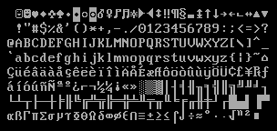
DOS Code Page 437
This is the one that most of you probably already know. It has its own version of squots, but they’re incomplete: it doesn’t have quarter-box or squot-grained checkerboard characters, tlhough it does have three forms of half-tone, a rather extra assortment of double-lined box characters, playing card suit glyphs, and a number of unusual characters up above that will be very familiar to anyone who played PC Rogue.
DOS Code Page 437 was in many ways the end of the venerable tradition of character set graphics. Neither the Atari ST nor Amiga had much use for general purpose character graphics, instead choosing to use their sets’ spare capacity for international characters, a noble offering, but less useful for graphic use.
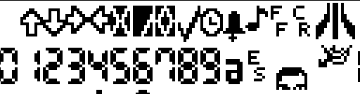
It is worth noting some of the characters in the ST’s set, though:
Some miscellaneous glyphs like arrows, an X mark and checkbox, a bell and musical note, the Atari logo in two characters, a bunch of digital readout numbers, and four characters that seem to form a face. Here, I’ll piece it together for you:
Who might this handsome person be? It’s a little hard to make out at this scale, but it’s intended to be a pixel-art representation of “Bob” Dobbs, icon and symbol of the Church of the Subgenius!
We’ve brought up a couple of examples of Commodore PET software lately, which as I keep saying, is interesting because the PET has no way of doing bitmapped graphics, sprites, or even definable characters. Its characters are locked in ROM and cannot be changed. So, it includes a set of multi-purpose characters that was used throughout all the Commodore 8-bit line, even as late as the C64 and C128, which having definable graphics didn’t need these kinds of generic graphics characters, but they were still useful for people who didn’t want to create their own graphics.
The PETSCII characters, as used on the Commodore 64 (image, with some editing, from Wikipedia). The graphics set also includes reverse-video versions of each character.
Back on my Commodore coding days I became very familiar with these characters. I think they’re much more universally-applicable for graphic use than the IBM equivalent, the famous Code Page 437, although that’s mostly because PETSCII doesn’t bother defining supporting so many languages. Code Page 437 also uses a lot of its space for single and double-line versions of box-drawing characters, although on the other hand it doesn’t waste characters defining reverse-video versions of every glyph.
PETSCII has:
A space and reversed space, of course.
Line drawing characters for boxes of course: vertical and horizontal lines, corners, and three- and four-way intersections. There are also curved versions of the corners.
More line-drawing characters for borders.
Still more horizontal and vertical lines, at each pixel position within their box.
With the reverse-video versions, enough characters to effectively do a 80×50 pixel display, as if it had a super low-res mode.
Different thicknesses of horizontal and vertical lines too.
Diagonal lines, and a big ‘X’. Note that on the PET and Vic-20 these lines were all one pixel wide, but on later computers with both better resolution and color graphics they were made thicker, which means diagonal lines have “notches” between character cells.
Other miscellaneous symbols: playing card symbols, filled and hollow balls, and some checkerboards for shading. On the PET and Vic, the shading characters were finer, while on the other 8-bit computers they were made of 2×2 boxes.
There are resources that let you use PETSCII to create old-school computer art, like this PETSCII editor, Petmate and Playscii, and for a bunch of examples of what you can do with it you can browse through the Twitter account PETSCIIBots. And this blog post from 2016 both makes the case for PETSCII as a medium for art and provides some great examples of it.
We love games made for unlikely hardware, and PETSCII Bros. fits that bill like a duck’s dentures. Like we explained in the post about that PET demo from a while ago, the PET didn’t have changeable graphics characters and no bitmap mode at all, and so it wasn’t what we’d consider a games machine. But it did come with a set of interesting graphics characters that, among other things, had a set of 16 characters that let programmers use the screen as a super-low-res 80×50 pixel display.
PETSCII Bros is a PET action game that uses those characters (long called “PETSCII” as a cheeky reference to ASCII) for an actual game, that plays similarly to Nintendo’s classic Mario Bros. arcade game. Of course you’ll need a PET, or an emulator (such as the one that comes with VICE) to play it. Or if you’re just passing interested, you could watch this video to see how it works:
The Commodore 64 was not Commodore’s first home computer. It wasn’t even the VIC-20. Their first machines were the line of the PET, or “Personal Electronic Transactor,” as labored an acronym as any.
The PET was a decent machine, with integrated monochome monitor and a heavy metal case. Although it had no color, no sprites, only a basic speaker for sound and no synth, it had a number of things in common with the later C64, particularly the 6502 processor that lay at the core of half of the personal computers sold at the time.
There was something else, something fairly major, that the PET lacked: customizable graphics. No hi-res mode, and no programmable character sets. The graphics were encoded on a ROM that wasn’t even mapped to the CPU’s address space. The letter ‘A’ would forever look like a letter ‘A’. It couldn’t be changed to anything else, even a slightly different ‘A’. This greatly limited what PETs could display, and basically doomed it as a gaming computer.
Commodore tried to compensate for this feature by including “PETSCII,” a set of custom characters included in the upper 128 characters of its ROM intended for makeshift graphics. PETSCII would survive throughout the rest of the Commodore 8-bit line, even featuring on machines that had programmable graphics: the VIC-20, C64 and C128 all had it included too. (The Twitter account PETSCIIBOTS (now inactive) shows off its many graphical characters in making robots.)
On the later machines PETSCII graphic characters were a fun nicety. On the PET, they were all you had, all you would ever have. This is exactly the kind of limitation that demo authors love circumventing where they can, and taking advantage of when they can’t. Hence: Back To The PET, a demo, complete somehow with chiptunes, that runs on Commodore’s ancient machine:
Every character cell of every frame of this video is one of the PET’s 256 ROM-based characters. It had no hardware scrolling, so effects are all faked or done 8 characters at a time. Yet it’s still pretty slick! The PET had quite a better selection of graphics characters than even IBM’s code page 437, including lines of single pixel differences in thickness and horizontal and vertical position. Image what the ASCII artists of the 90s could have done with this selection! Luxurious!