It’s a bit light, maybe, to be a day’s sole post, so I’m throwing this in as an extra. I was looking through my saved post list on Bluesky and found a few entertaining images that speak to me. Largely they say, “@!#?@!“, just like Q*bert does. Please enjoy, if you are capable of that. I won’t hold it against you if you aren’t. Links are provided so that you can follow these fine arteests/screenshooters/shitpostors.
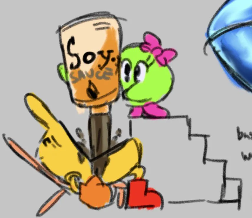
Where does Pac-Man, um, pack the stuff he eats? If soy sauce existed in Pac-World this would definitely happen, and Miru would play along, that enabler. Meanwhile Pac-Man’s blood pressure is 3,000/a million.
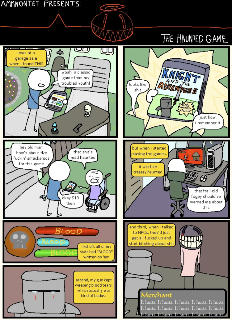
This is exactly what all creepypasta sounds like to me. I only enjoy media where nothing bad ever happens and at the end you’re handed a free puppy.
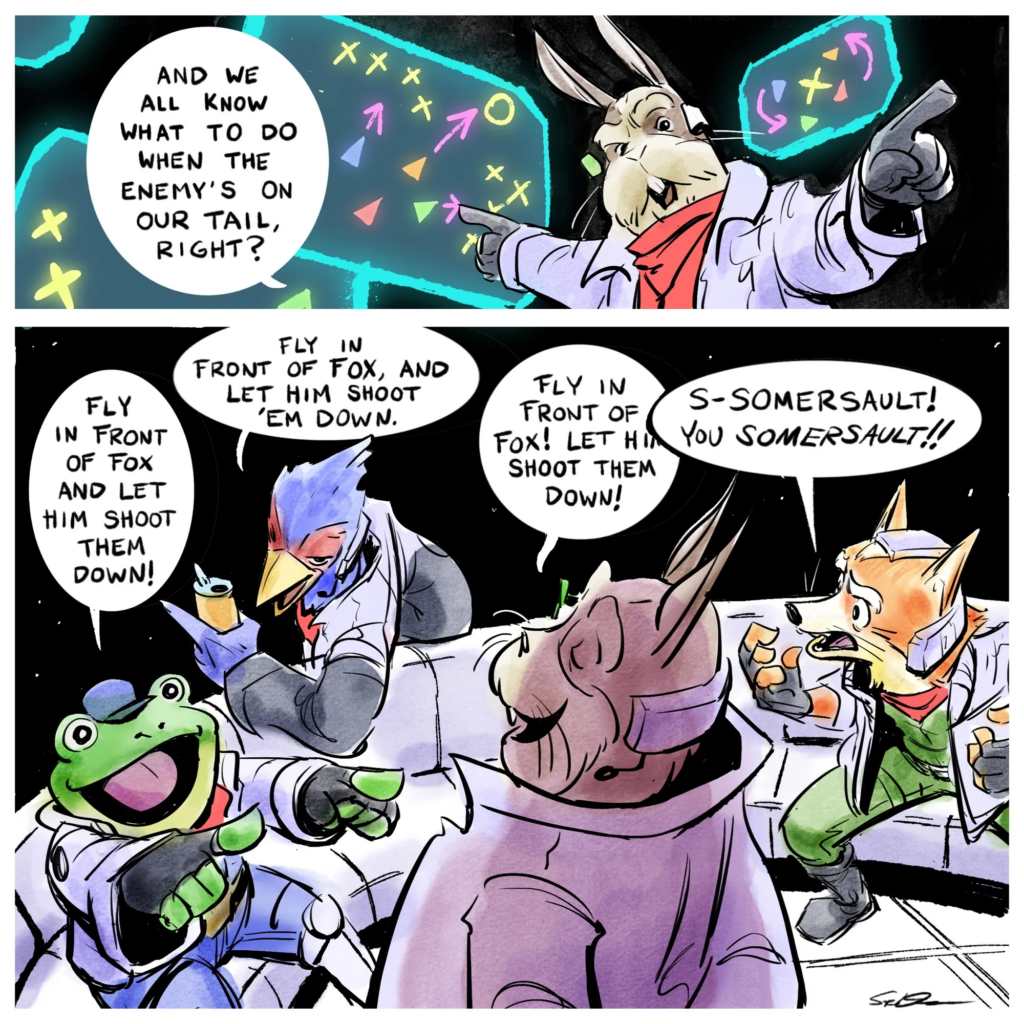
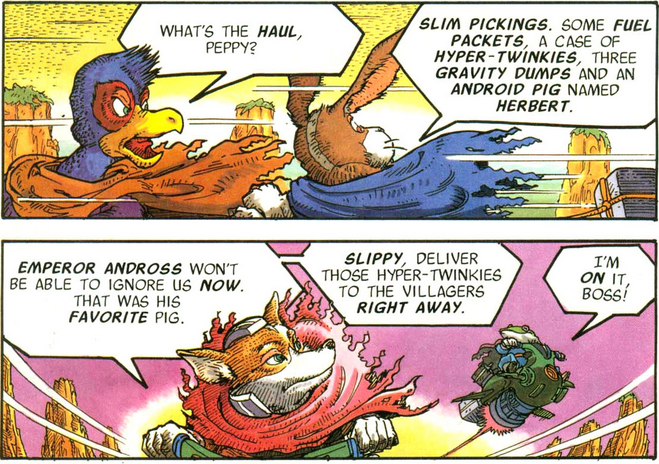
From “Steeeve Duffy,” who has many great comics, but whose name has too many e’s:
It’s easy to imagine the voices from the N64 game speaking the characters’ lines. Later games established that Peppy Hare is getting on in years, and I like to think that inspired his scruffy depiction here.
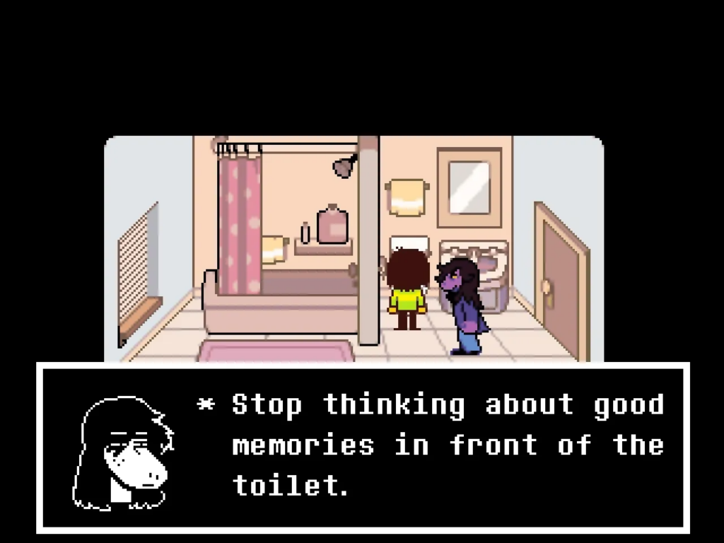
Susie’s severed head has to put up with a lot. The way her right eye shows through her hair, anime-style, makes her look like a David Bowie-style glam rock star: Susie Stardust.
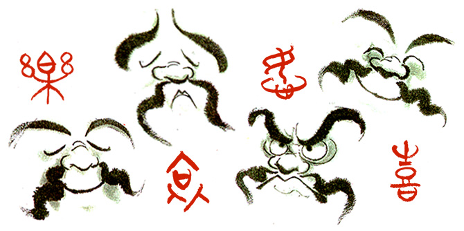
I was listening to Retronauts 768 a couple of days ago, about the 20th anniversary of the release of Mother 3. It was interesting and you might enjoy it too, but the reason for this post is that they mentioned that Nintendo art legend Benimaru Itoh still maintains an old-school website.
That is a thing about Japan; it’s on average behind the times concerning technology and internet trends, for example Geocities Japan outlived the original by a decade, but it looks more and more like that’s actually a really good thing as the Western internet dives enthusiastically down the cyber-commode. Old-school websites are in again, at least among the right people, and one of those people is Benimaru Itoh.
The focus is mostly on his art, all of which I find very nice. Like this one:
So nice!
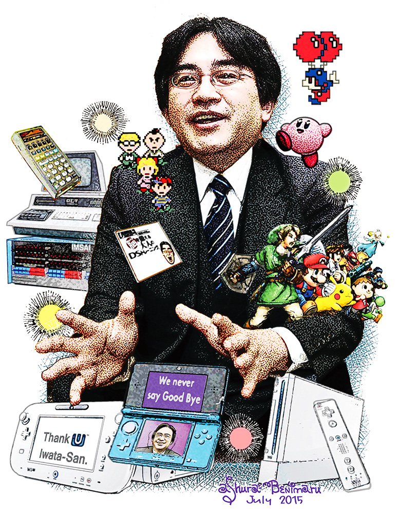
Or this heartfelt image in memory of Nintendo’s beloved late president Satoru Iwata, who programmed many games for HAL Laboratory:
There’s plenty of other examples on the site, many of them promotional music posters. More in line with our focus here at Set Side B, Itoh was the artist of some of the old Nintendo Power comics, like the Metroid and Star Fox series. He’s also a musician, and has “a doubleneck acoustic/electric mandolin/ukelele!”
Maybe Benimaru Itoh didn’t write this dialogue, but he could have.
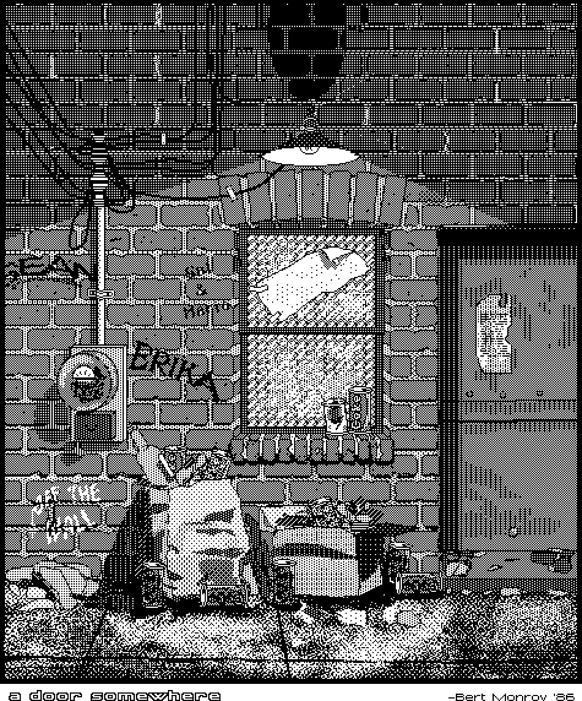
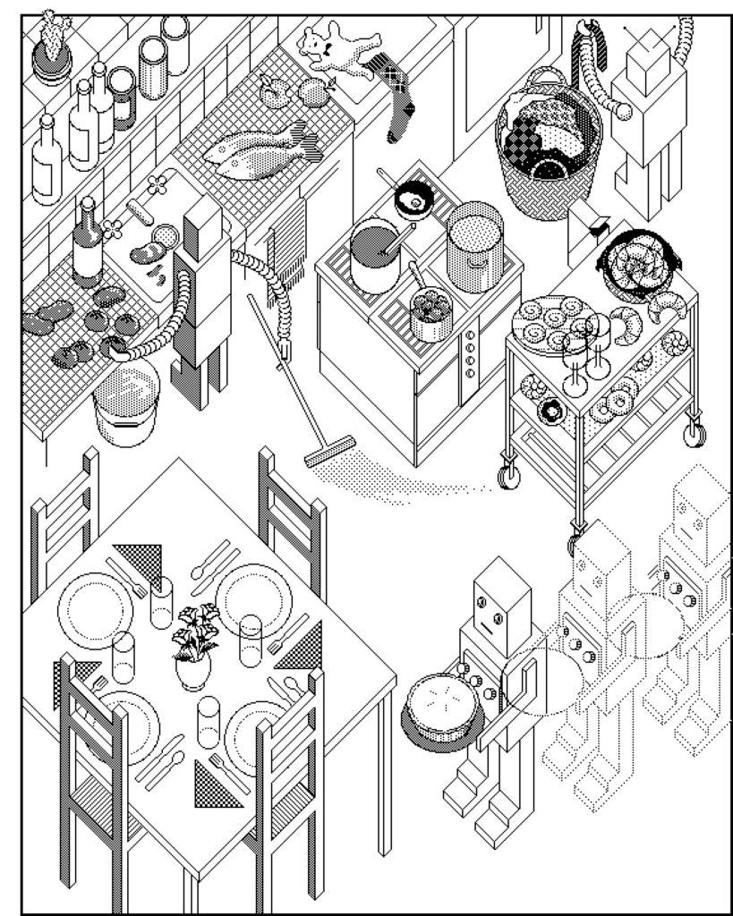
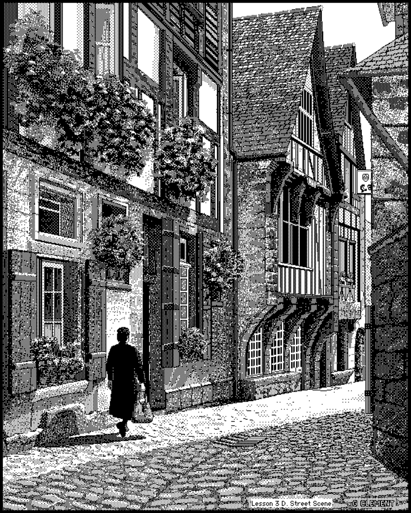
From July of last year, the blog called decryption posted a bunch of wondrous examples of 1-bit MacPaint art from the early days of the platform. MacPaint had a distinctive aesthetic: tiny dots, each either white or black, favored the use of dithering to create makeshift grayscale. (Note: one image is NSFW.) Here’s a few selections, but there’s lots more where these came from!
If this kind of thing is up your monochromatic alley, decryption’s on Mastodon and Bluesky!
I’ll be honest, I got caught off-guard by the need to make today’s post, so it’s pretty simple today. But it’s still pretty cool.
There’s this Korean person who goes by Sanago on Youtube who used 3D pens to make models of various pop culture characters, and some of them are of video game characters. Here’s Sonic (11 minutes):
It’s an interesting problem. One interesting is the pixelization is an intrinsic part of it. The less obvious the pixels are (like, if the invader is too large), the less aesthetically pleasing it tends to be.
Posts will be a bit lighter for a week and a half or so, as I travel to and attend DragonCon again this year. If you’re going too, let me know!
A while back I linked to a video showing the obscure “Data Over Flow” error in Mario Paint. Here’s the post, and here’s the video (1 minute):
It occurs because Mario Paint’s SRAM is only 32K in size, which isn’t large enough to store every possible creation. The cartridge uses data compression to squeeze everything in, but the thing about data compression is, it can never be guaranteed to work. Every possible compression format has data that will cause it to take up more space. It’s a fact about the universe we live in. It just is.
If you only use the canvas, or only use the “Animation Land” motion option, then there is enough RAM, but using both in one composition means the software relies on compression to make everything fit, meaning, some kinds of data won’t fit, and that’s when Data Over Flow happens.
But as it turns out, while if you’re using Mario Paint in the way most people it’s unlikely you’ll trigger the error, it isn’t actually difficult to cause it. Creating a random mess of all the colors of pixels in a stamp, then filling the whole canvas and all the animation frames with that stamp, seems to be enough to do it. Mario Party doesn’t use a particular complex compression format. Maybe if it used something lossy like JPEG it might be able to do it, but rather it uses bit-perfect compression. That kind likes repeating patterns and areas of solid color, and doesn’t like what I’m going to call rainbow snow.
So here, watch a user start from a blank project, on real SNES hardware recorded through video capture, and go directly to the Data Over Flow error. Sorry! Our RAM is too sick to contain your masterpiece, it has vomited it all up, please try again (3 minutes):
Found by long-term MeFite Going To Maine, DOOM: The Gallery Experience is a DOOM mod that changes out all of its various elements for museum equivalents. Ammo becomes drinks from among Wine, Beer, Gin or “Watr”; Health has become Cash (which you can spend in the gift shop) and Armor becomes Cheese. (You still pick them up like powerups, though.) And there’s still secret passages to find. The map is generally the same as that as the first level from the shareware game, although the demons have been moved out and replaced with objets d’art, all of which can be examined for information on the work.
I feel like I should adopt some standard way to inform people which items are links to other sites (with minor commentary attached) and which are significant longform items of our own creation.
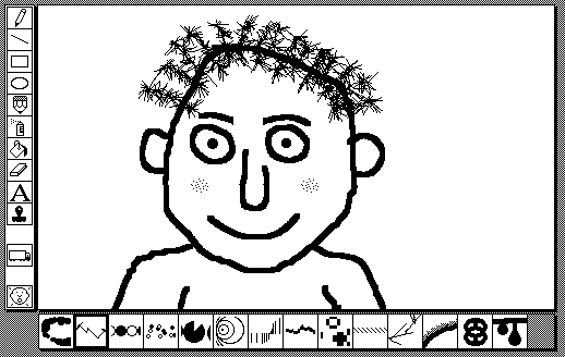
Suffice to say this is the former category. I didn’t write this history of Kid Pix: Craig Hickman wrote it, back around 2013. And he also created the original version of that program too. And it was terrific. Here is the link.
Kid Pix in its original format
What was Kid Pix? It was a paint program for early Macintosh models that was very well-received, and is very fondly remembered. It had a powerful UI but was still, neverthless, aimed at kids. Think of it as a more fun version of MacPaint. I refuse to stay in my lane regarding entertaining uses of computers, but perhaps of more interest to what I’d think are our usual readers, it had a similar concept to the art module of Mario Paint, but came out at least a couple of years earlier.
I especially like how he described the original Macintosh UI as having “a consistent and enlightened vision behind it,” which I’m not sure can be said of Macs today, or really of the products of any major software company. That’s just my opinion, mind you.
Did you know there is a Javascript re-implementation of an older version of Kid Pix? Here!
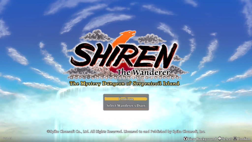
I’ve been playing a lot of Shiren the Wanderer: The Mystery Dungeon of Serpentcoil Island lately. Partly in preparation to add a chapter on it to my Mystery Dungeon book, partly because I like Mystery Dungeon games. I streamed my playthrough of finishing the main dungeon (on my first attempt!) here.
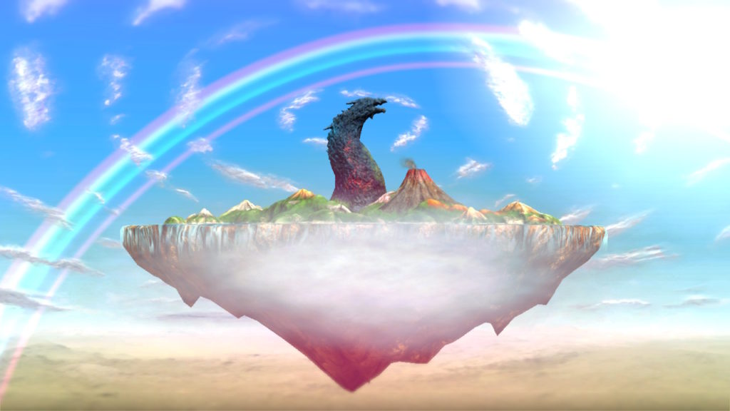
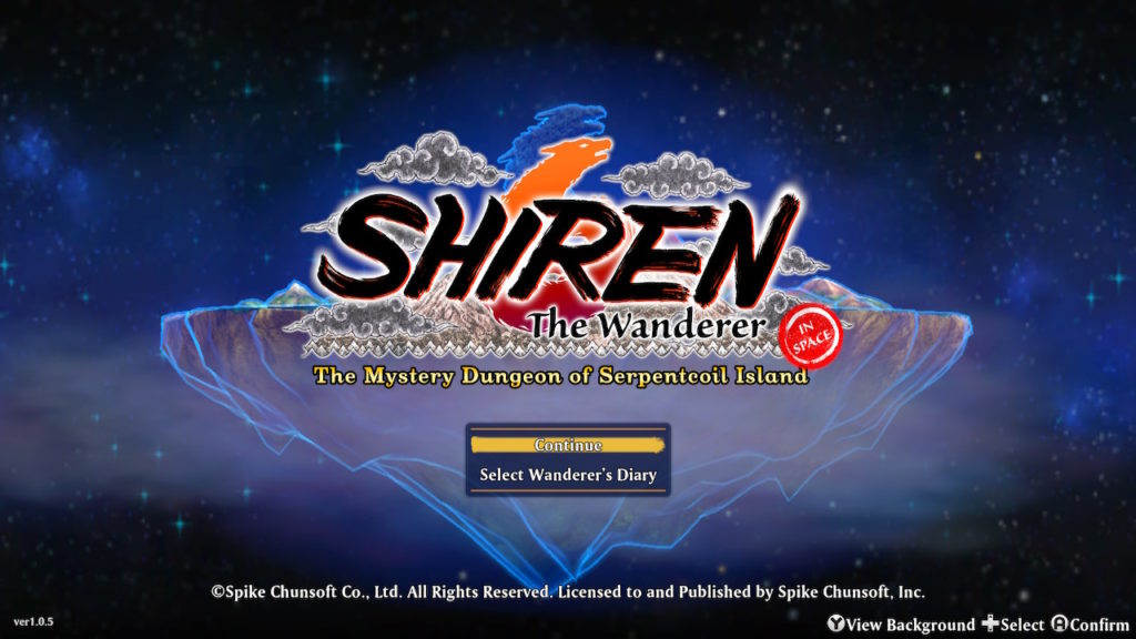
Here is the title screen (which is a spoiler for after finishing the main dungeon, although that is really only a short way into the game):
After you finish every other task in the game, including finishing the final 99 Floor “megadungeon” where most items are unidentified, the title screen changes to add a nice rainbow:
I forgot to get a picture with the title in place. I can’t go back and get it now because of what followed….
There is one more thing to do at that point though. That is to play through the megadungeon again, but finding 12 “Celestial Stones” that severely restrict your inventory by the end.
Well, I’m not sure if they really counted on anyone doing that? There doesn’t seem to be much reward for it. It doesn’t go remarked upon by anyone in the game. But it does change one thing: the title screen. Here it is:
I like the red “IN SPACE” stamp! Sadly, all the graphics in the actual game still show an island floating in the atmosphere, and not in orbit. I wonder if they plan on doing something with this in an update? That seems like a lot of extra work for the benefit of not a lot of people.
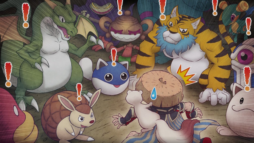
Looking through my screenshots, I found this illustration that can be unlocked for behind the main menu, showing Shiren stumbling upon a Monster House:
There’s a lot more to say about Shiren 6, after I gather up my thoughts about it….
I don’t see as many fan shrine sites as I used to. Old ones have died out or, in the best case, gone into archive mode, and new ones aren’t replacing them as quickly, or at least don’t seem to be. It could be I don’t search for them as often, or Google not surfacing them as much-not only has the quality of its search degraded markedly over the past decade, but for whatever reason its results seems much more focused on answering questions and selling things. Google also seems a lot more like to give you links from big sites, instead of small web sites made by individuals.
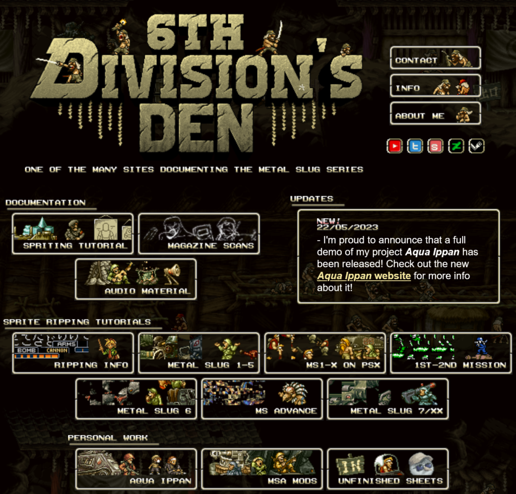
That’s why I was please to find 6th Division Den, a site focused on Metal Slug that the Wayback Machine suggests was founded as recently as 2018. I didn’t find it through Google, but as the host of the official site of the game from yesterday’s post, Aqua Ippan.
Much of the site’s content is devoted to creating pixel art and on getting the images out of the games, but it has a lot of examples to go by. And the site itself looks great! I don’t see many sites like this anymore, but I’m glad they can still be found from time to time.
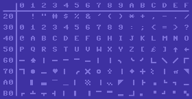
We’ve brought up a couple of examples of Commodore PET software lately, which as I keep saying, is interesting because the PET has no way of doing bitmapped graphics, sprites, or even definable characters. Its characters are locked in ROM and cannot be changed. So, it includes a set of multi-purpose characters that was used throughout all the Commodore 8-bit line, even as late as the C64 and C128, which having definable graphics didn’t need these kinds of generic graphics characters, but they were still useful for people who didn’t want to create their own graphics.
The PETSCII characters, as used on the Commodore 64 (image, with some editing, from Wikipedia). The graphics set also includes reverse-video versions of each character.
Back on my Commodore coding days I became very familiar with these characters. I think they’re much more universally-applicable for graphic use than the IBM equivalent, the famous Code Page 437, although that’s mostly because PETSCII doesn’t bother defining supporting so many languages. Code Page 437 also uses a lot of its space for single and double-line versions of box-drawing characters, although on the other hand it doesn’t waste characters defining reverse-video versions of every glyph.
PETSCII has:
A space and reversed space, of course.
Line drawing characters for boxes of course: vertical and horizontal lines, corners, and three- and four-way intersections. There are also curved versions of the corners.
More line-drawing characters for borders.
Still more horizontal and vertical lines, at each pixel position within their box.
With the reverse-video versions, enough characters to effectively do a 80×50 pixel display, as if it had a super low-res mode.
Different thicknesses of horizontal and vertical lines too.
Diagonal lines, and a big ‘X’. Note that on the PET and Vic-20 these lines were all one pixel wide, but on later computers with both better resolution and color graphics they were made thicker, which means diagonal lines have “notches” between character cells.
Other miscellaneous symbols: playing card symbols, filled and hollow balls, and some checkerboards for shading. On the PET and Vic, the shading characters were finer, while on the other 8-bit computers they were made of 2×2 boxes.
There are resources that let you use PETSCII to create old-school computer art, like this PETSCII editor, Petmate and Playscii, and for a bunch of examples of what you can do with it you can browse through the Twitter account PETSCIIBots. And this blog post from 2016 both makes the case for PETSCII as a medium for art and provides some great examples of it.
I’ve been trying lately to take it easy on the Youtube posts, but in this age of the internet they seem unavoidable. This one though, I think is unquestionably worth it, a six-minute video of the illustrator of classic Final Fantasy games (whose work mostly came through in monster images and manual art) doing a piece for the cover of the CD soundtrack in preparation for Cuphead’s Japanese release. The early moments of the video are preliminary sketches that show them getting used to the characters; the work he settles on is a Final Fantasy-esque interpretation of Cuphead and friends (and enemy). Thanks to NoxAeternum to finding this and posting it to Metafilter!

