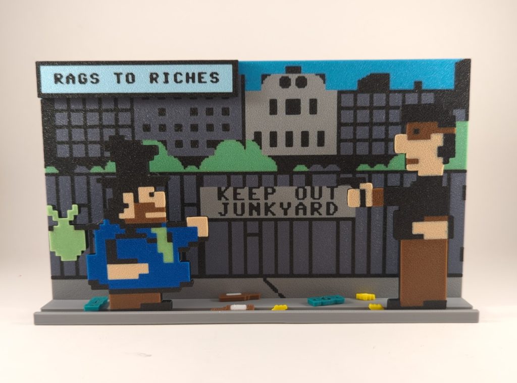
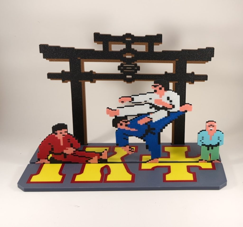
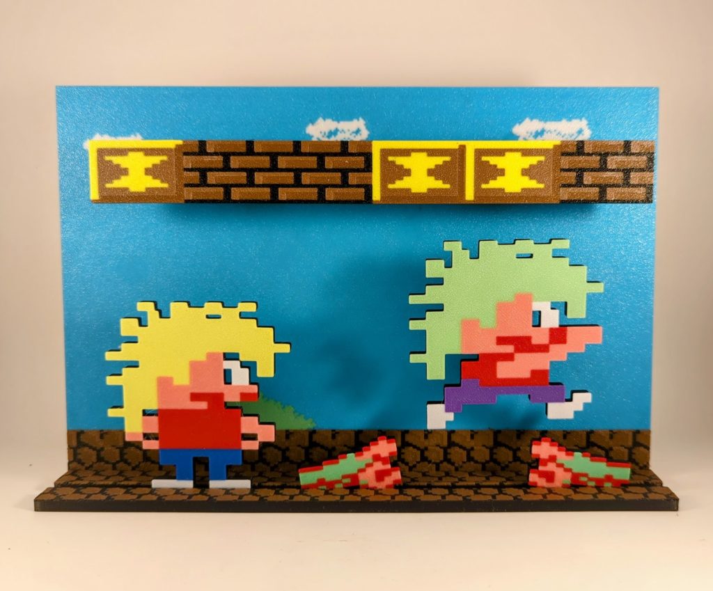
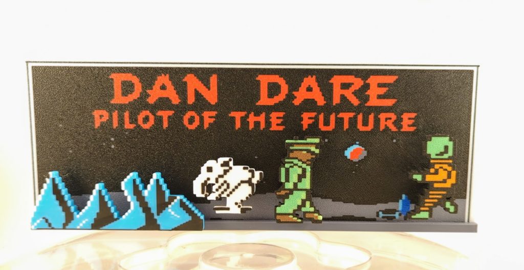
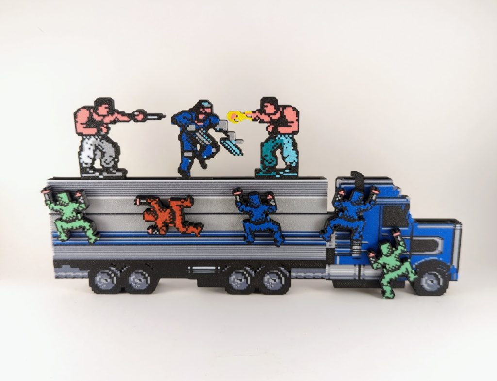
Clivefrog77 makes these nice gaming dioramas, often based on European Commodore 64 games, and sells them on eBay. He has a page on Google Photos. I’m not sure if all of those are his, but a lot seem to be.
The Flipside of Gaming
Clivefrog77 makes these nice gaming dioramas, often based on European Commodore 64 games, and sells them on eBay. He has a page on Google Photos. I’m not sure if all of those are his, but a lot seem to be.


8-bit microcomputer graphics were, compared to the graphics cards and chips we mostly use today, pretty limited. While machines like the Commodore 64 and Atari 800 allowed for a fully programmable display, not all devices of the age provided for that.
One solution was what I am told is now called semigraphics, which means using generic characters that are pre-defined by the system in combination with each other, piecing together larger images from symbolic building blocks.
ASCII Art, that fading art form created to make imagines on terminal displays, is a form of semigraphic. The IBM PC character set supported semigraphics mostly through its famous Code Page 437, which provided a variety of line-drawing characters , but looking at it it’s evident that it wasn’t intended for general graphic use.
Different platforms from the time varied widely in their support for graphic characters. Let’s take a quick look at what the options were.
The base Apple II had a very limited character set:
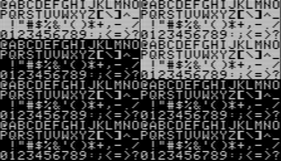
The Apple II’s character offers little opportunity for graphic use. Of course the Apple II is a miracle through and through for being designed almost entirely by one person, Steve Wozniak, and that includes its character set. Note that it doesn’t neglect reverse video, and even has hardware support for flashing characters. Still though, not much you can do with it other than repurpose punctuation and letters.

The PET and successors, by contrast have an excellent character set for makeshift graphics. The image above is of the Commodore 64 version, but the same graphics are used on old PETs, the VIC-20, the Commodore 128, and even the TED-based machines, the Plus-4 and Commodore 16.
While they’re not reflected in the above image, the whole character set can be reversed too. These machines reverse characters by, simply, duplicating the whole set in ROM as negative images.
PETSCII contains:
PETSCII is one of the most versatile character sets from the time, and you can do a ton with it with some thought and ingenuity. There used to be a Twitter account (in the days before the Muskening) that posted images of robots made out of PETSCII characters. And because the character set is included in ROM, one doesn’t have to create their own character graphics, using up 8K of system RAM to hold them, to have rudimentary graphics. (In fact, the original PET didn’t even support redefining the character set, so PETSCII was all you got.)

Did Atari consciously follow the naming of PETSCII, with their own self-branded ATASCII? Both are riffing off of ASCII, which stands for American Standard Code for Information Interchange. So I guess PETSCII, going by Commodore’s own claimed meaning for PET, means “Personal Electronic Transactor Standard Code for Information Interchange,” which is pretty terrible. But the ATA in ATASCII makes even less sense, since ATA obviously is just the first three letters in Atari.
While it has nowhere near the sheer number of graphic characters that PETSCII has, it had a decent number, including line drawing, slopes and diagonal lines and playing card suits. Of particular note is that the Clubs symbol has the same hole in its middle that it does in PETSCII.

Wikipedia doesn’t offer a screenshot chart of all the symbols of the TRS-80 set, but it does an HTML Table display, which the above is excerpted from. The only graphic characters it has are these off 2×3 cells, which are like the 2×2 blocks in the Commodore set but with an extra row. This gives its screen slightly finer resolution.
The TRS-80 had fairly basic graphics, it seems: those characters appear to have been it as far as graphics goes. The page I saw that described its capabilities even had a name for those blocks: squots. I think that’s a perfectly fine name for these kinds of boxes, whether it’s on a TRS-80, Commodore 64 or other machine.
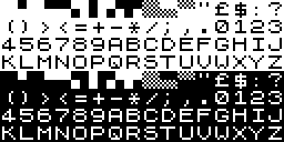
The ZX-81 had a very limited character set. While it has checkerboard and 4×4 block characters, their inclusion comes at the cost of an apostrophe, an at-sign, and even an exclamation point.
The following Spectrum removed the checkerboards, but added the exclamation point and apostrophe, as well as a lowercase alphabet. Still no @ though.
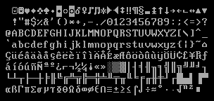
This is the one that most of you probably already know. It has its own version of squots, but they’re incomplete: it doesn’t have quarter-box or squot-grained checkerboard characters, tlhough it does have three forms of half-tone, a rather extra assortment of double-lined box characters, playing card suit glyphs, and a number of unusual characters up above that will be very familiar to anyone who played PC Rogue.
DOS Code Page 437 was in many ways the end of the venerable tradition of character set graphics. Neither the Atari ST nor Amiga had much use for general purpose character graphics, instead choosing to use their sets’ spare capacity for international characters, a noble offering, but less useful for graphic use.
It is worth noting some of the characters in the ST’s set, though:

Some miscellaneous glyphs like arrows, an X mark and checkbox, a bell and musical note, the Atari logo in two characters, a bunch of digital readout numbers, and four characters that seem to form a face. Here, I’ll piece it together for you:

Who might this handsome person be? It’s a little hard to make out at this scale, but it’s intended to be a pixel-art representation of “Bob” Dobbs, icon and symbol of the Church of the Subgenius!

It’s not a good set of squots, but it’s not bad.
I don’t see as many fan shrine sites as I used to. Old ones have died out or, in the best case, gone into archive mode, and new ones aren’t replacing them as quickly, or at least don’t seem to be. It could be I don’t search for them as often, or Google not surfacing them as much-not only has the quality of its search degraded markedly over the past decade, but for whatever reason its results seems much more focused on answering questions and selling things. Google also seems a lot more like to give you links from big sites, instead of small web sites made by individuals.
That’s why I was please to find 6th Division Den, a site focused on Metal Slug that the Wayback Machine suggests was founded as recently as 2018. I didn’t find it through Google, but as the host of the official site of the game from yesterday’s post, Aqua Ippan.
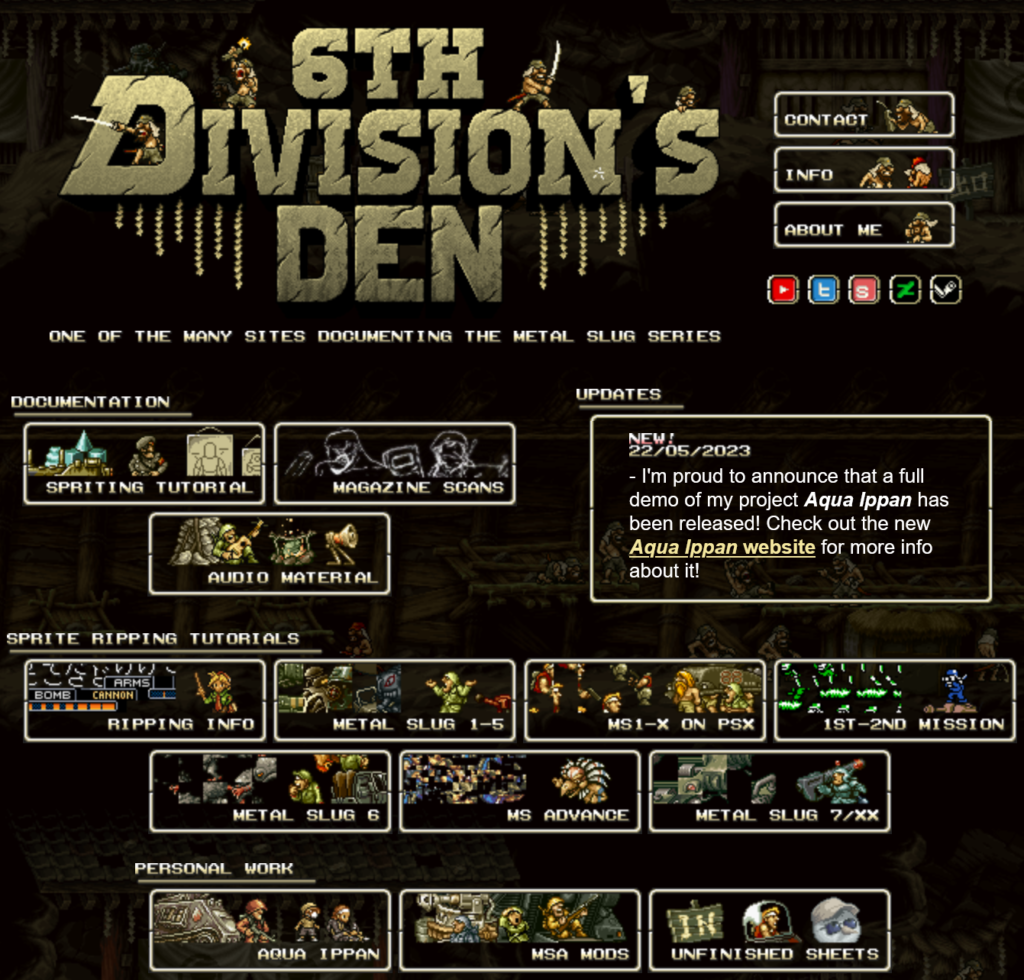
Much of the site’s content is devoted to creating pixel art and on getting the images out of the games, but it has a lot of examples to go by. And the site itself looks great! I don’t see many sites like this anymore, but I’m glad they can still be found from time to time.
6th Division Den, Metal Slug fandom and resource site
This one’s coming to you from some years back. Ginormo Sword, by Babarageo back in 2008, a Flash game that’s playable once again via Ruffle. It is one of a small, but gratifying, genre of games where you start small and just get bigger and bigger and bigger, and part of the fun is just seeing to what extremes the game supports you going.
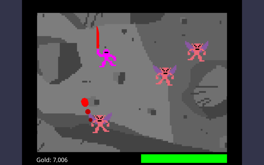
Games like Dungeons & Dragons pay at least lip service to realism, less so now than its origins, but it’s still there. There are limits, both theoretical and practical, to how far characters can gain levels, can gain statistics, can gain hit points, and that makes sense. For even Superman, when it comes right down to it, is still a roughly humanoid creature of a bit over six feet in height. If he were in the same comic universe as Galactus, it would defy credibility if this vast being were stopped by what to it was an amoeba.
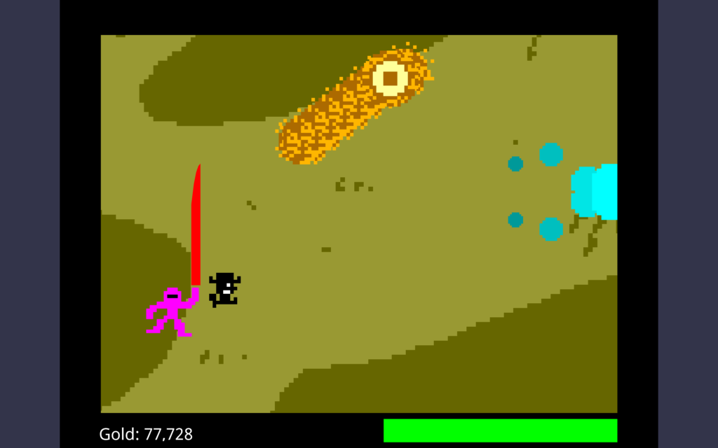
Ginormo Sword is what you get if you peel back these limits, and basically say, if you can earn the cash for it? You can do it. There are limits, but the game goes to ridiculous extremesbefore you run into them. It’s basically an “incremental game,” like a clicker, but in a different format. See for yourself.
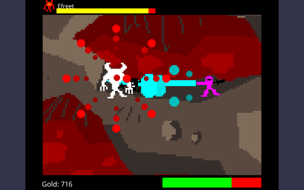
Ginormo Sword (browser playable, $0)
It’s Sunday again! This time we have for you a seven-year-old fan-made pixel art version of the Simpsons opening. It’s gotten 27 million views since it was uploaded, but some of you must have missed it, right?
It’s loaded with jokes and in-jokes, and is so pitch-perfect that it got used on an actual episode of The Simpsons! It really needs to be paused frequently to catch every reference.
SIMPSONS PIXELS (Youtube, 1:52)
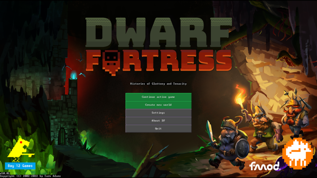
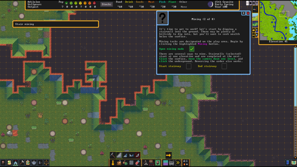
Dwarf Fortress has arrived on Steam, and me and blogmate Phil Nelson are so enthused! I bought it at full price nearly immediately, even though it’s $30 (there is no game in the world that’s a better value proposition for the money!) and played through the tutorial, and was pleasantly surprised that the interface learning curve is much better! The gameplay curve is just as high as it ever was, but that is all part of the game whose tagline is “Losing is fun!”
Longtime Urists will have a little adjusting to do, as some of the keypresses have been changed, some options moved around, there are no Kennels now, and it’s not obvious how to de-designate areas like tunnels to be dug. But compared to how it was before it’s an unquestionable improvement!
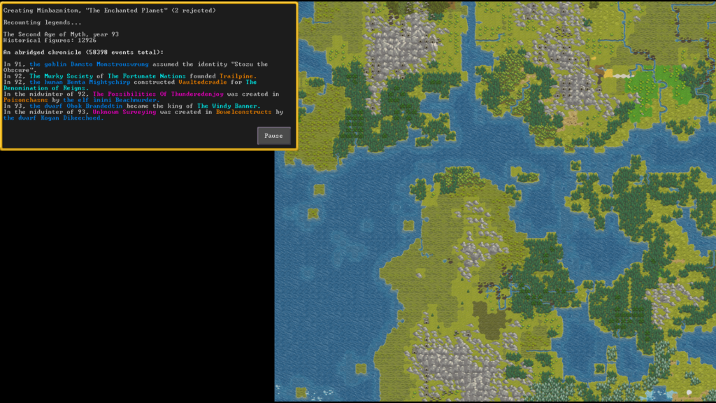
There’s also excellent pixel-art graphics, zoom support (hold Ctrl down while rolling the mouse wheel) and even a lot of new music! I wish there was an option to return to the ASCII-ish graphics, but with Steam support for mods I’m sure if they don’t provide it themselves, a fan will make it before long. And if you don’t have $30 rolling around in your pocket or purse, the game is still free on the official website, just as it ever was.
Polygon has not rested on this release, and immediately posted several useful articles for enthusiasts and prospective fortress chiefs, most of them written by Jeffery Parkin!
Dwarf Fortress on Steam ($30) – Dwarf Fortress at Bay 12 Games
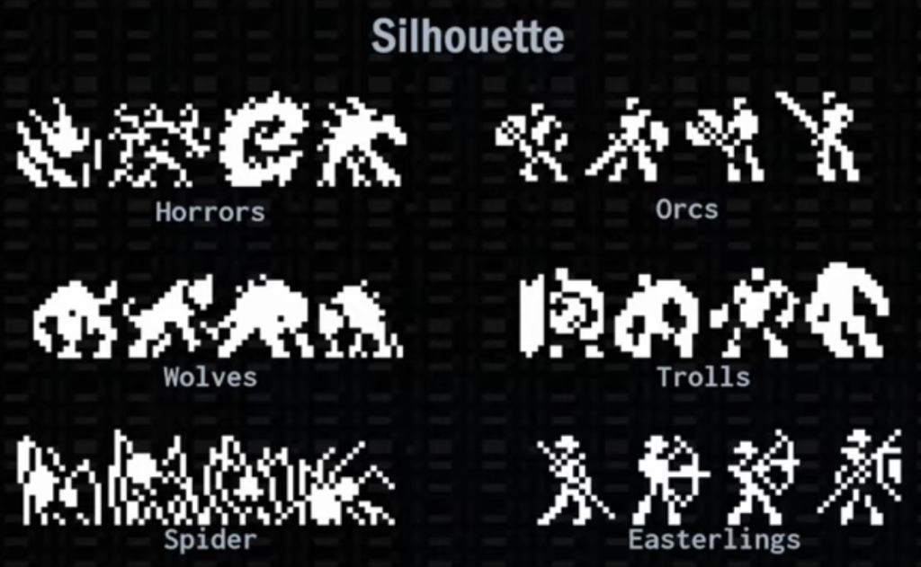
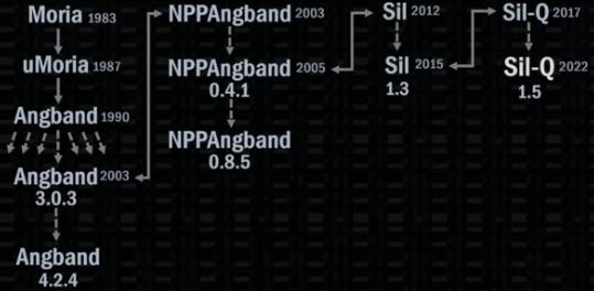
Sil-Q is an Angband variant. Joel Ryan, aka MicroChasm, made its tileset which shows a lot of care in its creation. Sil-Q’s tiles are modular, so humanoid monsters can hold weapons, and also have strong silhouettes to aid recognition. It’s full of the kinds of concerns pixel artists have to worry about!
On Romhack Thursdays, we bring you interesting finds from the world of game modifications.
When people think about NES games, they often think of pixel art. Big chunky pixels! It’s one of the defining aesthetics of our era. The NES occupies a niche between the truly blocky graphics of the Atari VCS era and the 16-bit consoles, which don’t have a much greater resolution than the NES (since the limitations of CRT displays were a big factor), but had a much greater color depth that could help smooth things out.
But it can be interesting, visually, to try to find a middle ground between the Atari and the NES. That is where the subject of this post comes in: The Legend of Zelda Chunky Edition, a graphics hack by Zero Meaning.
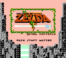
Only the graphics have changed, and just to make them more blocky, instead of the prevailing trend for remakes, which is to make them less so. (Oh also, the bright cyan of Link’s Blue Ring tunic has been darkened a bit.)
For some reason, this look suits The Legend of Zelda a lot! The greatest challenge to making it, I think is figuring out how to represent letters and numbers. You can see from the title screen above that the S, R and numeral 8 posed particular challenges, as did the copyright symbol.
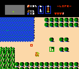
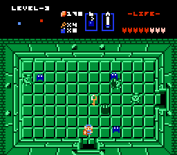
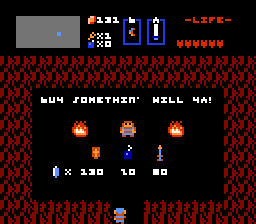
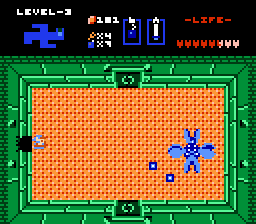
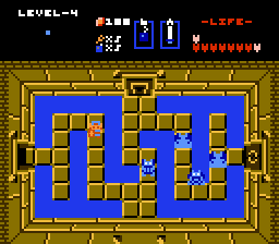
There’s not a lot more to say about this one! So here are a few screenshots of Zelda, chunky style.
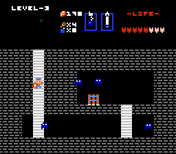
When you start using emulators, it won’t be long before you’re brought up against the choice of which scalers to use, a bewildering collection of options with names like Nearest Neighbor, AdvMAME3x, and RotSprite.
Resizing pixel images in an intelligent way is a difficult problem for many reasons. Most techniques intended for use on photographs won’t apply, since they’ll produce unacceptably blurry results when applied to extremely low resolution art. Pixel art is designed so that every dot matters, and adding new pixels carelessly can cause problems, such as Mario flipping us the bird in the right-hand image below:
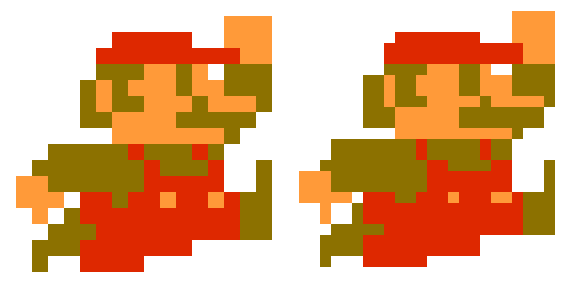
Additionally, being done frequently in real-time emulation, scaling algorithms must be fast. Yet the fastest solution, called Nearest Neighbor, produces very blocky results, and also only really works well if images are scaled up to an integer multiple of the original in X and Y dimensions.
A good backgrounder of various issues is available from an old blog post here, but there’s been some interesting advancements in the field since then. RotSprite is a good contemporary solution that also can rotate pixel art images well.
The problem of rotation is made simpler by a nifty trick that’s used by many image editors and libraries. It turns out you can rotate an image by an arbitrary amount with three simple shear operations. (If you don’t know what shearing is, it’s just tilting an image by some amount in a direction. It’s pretty awesome that this works since shearing is easy to do.)


“We scour the Earth web for indie, retro, and niche gaming news so you don’t have to, drebnar!” – your faithful reporter
Here’s all the most important gaming news for protoplasmic organisms! Fortunately our interest sphere intersects well with Earth gaming culture for some reason on which I will not speculate!
The Verge, Jay Peters: Steam now supports Nintendo classic controllers, the ones they released to support their Nintendo Switch Online service and are only sold to members of that service. This includes all of the controllers they released, including SNES and N64, which are probably the most interesting for general use.
IGN, Ryan Dinsdale: a fan is remaking The Simpsons: Hit and Run, and in the process is making hand-drawn versions of the cutscenes. That’s the one that was inspired by the 3D Grand Theft Auto series, not the one that was inspired by Crazy Taxi and is said to have been taken off the market due to a Sega patent on the gameplay (that one was Road Rage). It’s especially worth noting that according to this video, the game will never be made available for download, leading one to wonder… why are so many people posting about it, then? That’s a lot of animation work for one person’s enjoyment, I have to say.
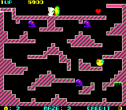
Destructoid, Chris Moyse: Bubble Bobble predecessor Chack’n Pop is coming to the Arcade Archives series. You can get some information on it from Jeremy Parish’s NES Works video on the NES port. BTW, I’d like to just shout out to Jeremy for being one of the most watchable, least strident and obnoxious, YouTube content producers out there. Anyway, Chak’n Pop. It’s a much less interesting game than B[u,o]bble, and only supports one player in any format, but you might find it interesting? But, is it $8 worth of interesting? (Eight whole dollars? Really?)
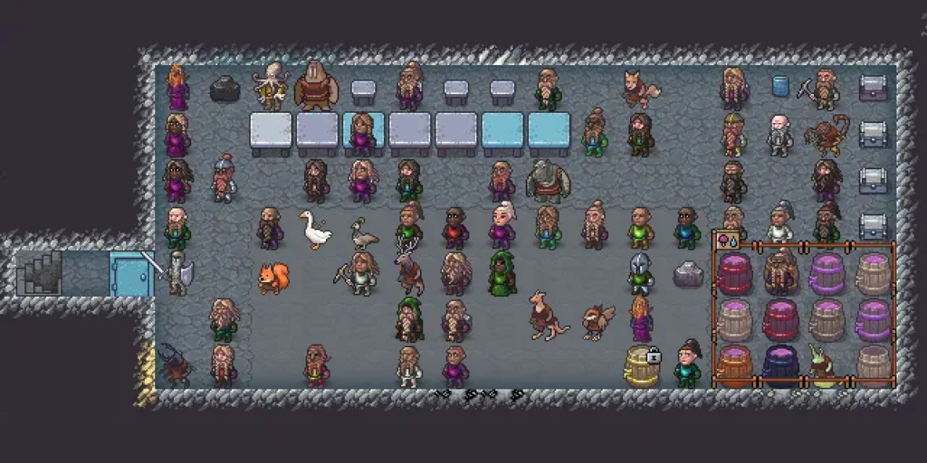
At Polygon, Charlie Hall expresses appreciation for the greatness of Dwarf Fortress‘ upcoming pixel art in its eagerly-anticipated Steam version, by artist Neoriceisgood. It seems like nearly everyone involved with gaming has a non-zero quantity of evil in their soul in some place, but Tarn and Zack Adams are as pure as you can find. I hope this works out for them. It’s so difficult to make it as an indie developer, especially one with such a niche following like DF. We wish them all the best.
And Liam Doolan at NintendoLife notes that video board game developer Asmodee Digital is, due to the closure of an important networking back end service (because of Amazon), ending online multiplayer for its Catan implementation. They’re also taking Pandemic off of the Switch eShop on July 31 (just three days from now!), although they seem to be hinting that it’ll be back in an improved and retooled version eventually. People who have already bought it will still be able to download it, but it won’t be sold to new users.
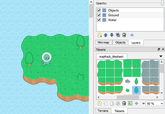
Popular and prolific game asset creator Kenney has a page up at Github that links to some of his favorite tools for manipulating pixel art, such as creating sprite sheets and extracting images out of them. It’s got a lot of useful info! If you have an interest in this style of art, especially making games with it, these programs are worth having in your toolbox.
Kenney: Manipulating pre-made game assets
It’s Sunday once again! You crossed, not a finish line, but a significant leg of the race. You deserve a reward. Here is one.
Orson Welles’ hilarious high-brow yet earthy tone, presented both as actual quotes and adapted, twice, have made the rounds lately. (Note: Welles had wide-ranging opinions of various degrees of cultural suitability, and so his posthumous imitators imagine he would now.) Here is a video of a pixel Orson Welles (no word on if he is also pixelated) trash talking various game characters. He is especially dismissive of Cool Spot.