It’s true! Thanetian Gaming on Youtube has an 18-minute video about Atari Games’ neglected classic Rampart. Remember back in September when I posted a strategy guide that no one asked for over four days? Judging by his video he could stand to read it, but no matter, I’ll accept anyone talking about my favorite arcade game in a positive light!
Tag: retro
Score Keeping on the NES
Sometimes I feel like I should put a content warning here when the technical level of a post is higher than usual. This one would probably be a five out of five for geekery. It’s a video from NESHacker on counting score on the Nintendo Entertainment System. But I don’t want to discourage you from watching it! It’s nine minutes long, and it contains a definition of the term double dabble.
Human-readable numbers are tracked by computers in a number of different ways. Nowadays we basically just do a printf or some version of it, but on a 1 megahertz platform, optimization really matters. It’s easy to think of computers as being impossibly fast, but in truth speed only ever counts relative to the efficiency of the algorithm you use. Computers are fast, but they aren’t all that fast.
One of the big tradeoffs in processor design is, fewer complex instructions that do a lot but take a lot of cycles, and processor complexity, to execute, or many simple instructions, each doing little and being relatively simple, and not needing a complex processor design to implement.
The 6502 microprocessor generally follows the latter design philosophy. It made some important tradeoffs to keep costs down. For example, it doesn’t have hardware that can multiply arbitrary numbers together. It relies on the programmer, or else a library author, to use the instructions given to code their own multiplication algorithm, if they need one. The result is going to be slower, probably, that if the chip had the circuits to do this automatically in silicon, but it reduced the cost of the chip, basically allowing more to be made, or else increasing the profits for the manufacturer.
Personally I’m a fan of just storing the score as a series of digits that match up to their positions in the character set. Gain 1,000 points? Just bump the 1000s-place up by one, and if it goes past 9, subtract 10 and bump the 10,000s place. That’s a tried-and-true system that many games use, and works well if all you ever have to do is add numbers. Comparing values, like for detecting extra life award levels, make things slightly more complex, but not by much. There’s sometimes other factors involved though, and that may explain why Super Mario Bros. uses different systems for its counters, as explained by NESHacker.
Sega to Delist Classic Games From Online Storefronts

“We scour the Earth web for indie, retro, and niche gaming news so you don’t have to, drebnar!” – your faithful reporter
(I decided to get some use out of the old news roundup post template for this item.)
News comes from Ars Technica‘s Kevin Purdy, and was announced on Sega’s website, a large number of items will be removed from Steam and all the major console storefronts with the end of the year, although as Ars points out, the Playstation and Switch storefronts are only seeing the Sega Classics Collection removed. Steam is seeing the most removals. Items on the Nintendo Switch online compilation will not be affected. Nothing removed will disappear from your library of online purchases (unlike what happened with Oxenfree on itch.io when it was picked up by Netflix), so if you want to play these items, in this form, later, buy them now, and you’ll “always” be able to download them again later. (Always deserves scare quotes because nothing online is forever, but you’ll be able to play them some while later at least.)
Why are they being removed? Purdy speculates that, like how Sonic the Hedgehog titles were removed in advance of the release of Sonic Origins, there’s probably some new collection of Sega classics in the works that these items will be a part of, or maybe they plan on bundling a bunch of them with a Yakuza game or something.
Sega’s website lists them all, but the great majority of them are Genesis titles, along with Nights Into Dreams for Saturn, and Crazy Taxi, Space Channel 5 Part 2, and the Dreamcast Collection, originally for Dreamcast of course. I personally recommend Crazy Taxi, of course.
The End-Level Signposts in Sonic Games
Will we ever run out of weirdly obsessive video game details to learn? I can’t rightly say, but for today at least there is a video from Bobby Bionic’s investigation into weird behavior by the signs at the end of Sonic the Hedgehog levels. (16 minutes)
Blaster Master & Wing of Madoola’s Lost Arcade Versions
Blaster Master, Sunsoft’s English localization of Japan’s Metafight, turns out to have an unreleased arcade version for the Vs. Unisystem. The Unisystem was substantially Famicom/NES hardware with some changes, so it makes sense that there were once plans to make an arcade version.
No known public copies exist, and I don’t think any ROM dumps have been released. The sole record of its existence may be a video (8 minutes) on the Youtube channel of higenekodo:
They have more videos on their channel than this one, including one of another possibly-unreleased Unisystem adaption of a Sunsoft Famicom game, the Wing of Madoola (16 minutes):
Both games have added scoring systems and other changes to adapt them for arcade play. Without ROM dumps though, we can’t know the full extent of the changes. Wing of Madoola seems to have been given an English localization, and had Gauntlet-ish timed health loss added to prevent player stalling, but it’s not known what changes were made to Blaster Master’s play to keep them moving. Blaster Master was also made less free-roaming: once you defeat the boss of an area and collect the powerup, the player is taken directly to the entrance of the next area, and each area begins with a map screen giving an overview of the area. And collected vehicle weapons appear in the corner of the screen, which suggests that the pause screen was removed.
I love hearing about games being adapted in design to meet different needs, like arcade play, and I’d love to try these modified versions some day to see what other changes were planned. Maybe they’ll come to light, eventually. I can only hope.
Super Mario All-Stars Random Debug Mode
We are told by The Cutting Room Floor this interesting fact. Super Mario Bros. 3 has a debug mode that activates when a specific memory location contains 80 hex, that allows the user to grant Mario any powerup. In normal play this never activates because the cartridge initializes all of RAM to 0 as part of initialization. But the version of the game included in SNES Super Mario All-Stars, while it closely follows the original’s logic in many ways including including debug mode and its criteria for activation, doesn’t initialize memory when starting up. When the console boots up, its RAM contains random voltages that can be interpreted as nearly any value, and there’s a chance that there’ll be 80 hex in memory location 7E0160, and enable the debug mode for Super Mario Bros. 3.
While ordinarily this would be a 1-in-256 chance, some consoles are prone to favoring specific values, so some units will turn on debug mode more often. As a result a legend developed that certain Super Mario All-Star cartridges are special debug versions that accidentally got put into retail boxes and sold.
Supper Mario Broth made a short video (about 1 1/2 minutes) explaining how it works in crudely animated form:
As it turns out, Mario All-Stars has its own debug modes for each game in the compilation, but the one for Mario 3 is different, and buggier. Meanwhile the original debug mode for Mario 3 remains, intact, buried in the code, waiting for the value 80 hex to appear in its magic location to unveil itself.
O-Chan vs Freeon-Leon
Kid Fenris wishes to remind us all that, in the Western release of Hebereke, called “Ufouria: The Saga” (and by “Western” I don’t mean the US, it never got a NES release over here), its localizers decided to rename its characters, and while doing so even redesigned two of them, turning protagonist Hebe into “Bop-Louie,” and fursuited girl O-Chan into the orange dinosaur Freeon-Leon.
The Hebereke bunch were already a random bunch of crazies, but they’re cute crazies. Sunsoft’s localizers tried to inject them with a dose of hip-serum. Here’s a brief summary:
 Hebe the penguin Changes: Rechristened “Bop-Louie,” given big eyes |
 O-chan the cat-suited girl Changes: Made a wall-eyed lizard not in any kind of suit, renamed “Freeon-Leon” |
 Jennifer the fish/frog thing Changes: Renamed “Gil” |
 Sukezaemon the ghost Changes: Renamed “Shades” |
Kid Fenris notes, in a pair of posts, that, in the recently-released sequel for Switch, the localized versions make cameos during the return to base cutscene!

Hebereke had a much more productive live in Japan, where the series got several sequels. The changed characters are a relic of the time when Sunsoft seemed uncertain of how to approach overseas markets. Blaster Mastered was (and is) revered, but didn’t sell as well as they expected, so they released a weird kind of sequel called Fester’s Quest, with Addams Family characters. They localized a Game Boy version of Hudson’s Bomber King (renamed to “Robowarrior”in English) as a sequel to Blaster Master, called Blaster Master Boy, and sponsored another sequel, made by Software Creations, for the Genesis.
Back on the NES, the license for a Terminator 2 game fell through, so they rebranded it as Journey to Silius, and not being able to get the Superman license scuttled plans to release another game completely, despite a hasty renaming to “Sunman.” Was there ever another game publisher so cursed with licensing issues as Sunsoft?
Two Modern Retro Games That Rock
This is a double review of Iron Meat and Alruna and the Necro-Industrialists both played with press keys.
0:00 Intro
00:14 Iron Meat
2:54 Alruna and the Necro-Industrialists

Owner of Game Wisdom with more than a decade of experience writing and talking about game design and the industry. I’m also the author of the “Game Design Deep Dive” series and “20 Essential Games to Study”
Gamefinds: Pac-Man Superfast
Part of Youtube’s doomed-to-fail Playables series, so enjoy this before it gets heartlessly deleted by Google when they decide games on their video platform don’t make sense, isn’t worth it, or whenever Netflix gives up on games and they don’t feel they need to compete on that front anymore.
The game is basically Pac-Man, but with a Championship Edition-like speedup gimmick. As you eat dots, the game slowly increases the simulation rate. it never really gets up to CE’s white-hot speeds, but it does get pretty fast. You get a slight slowdown when you finish a board and lose a life. Since you start with five lives, earn an extra one every 5,000 points, and each of a rack’s three (instead of the arcade’s two) fruit are worth at least 1,000 points, and even more as you advance to later boards, you are unlikely to run out of lives. The game ends after 13 levels, so you have a decent chance of finishing this one!
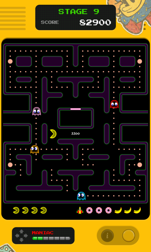
My best score is right around 150,000 points, but I was only playing casually. See if you can do better!
Who the Heck is Dragon Quest’s Mutsuheta?
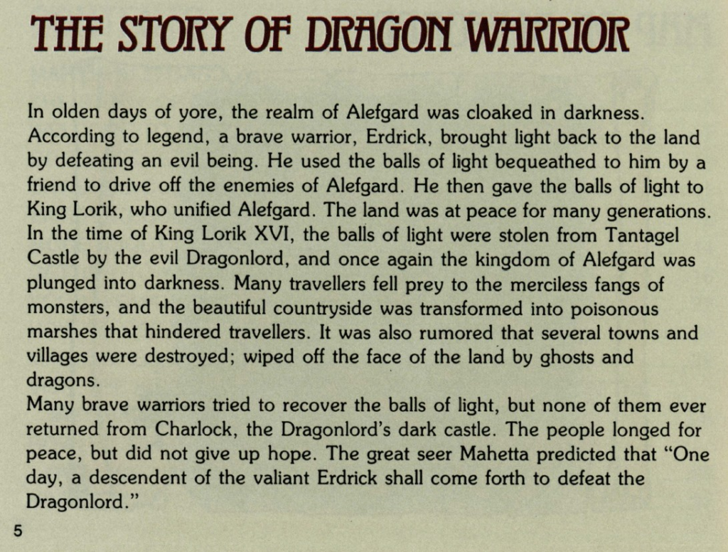
Kurt Kalata’s Hardcore Gaming 101 posted an article telling us about Mutsuheta, renamed Mahetta in the English localization for the NES. Mutsuheta is one of those figures who only appeared in the original game’s manual. Mutsuheta was the prophet who foretold that a descendant of the great Loto/Erdrick would arise and defeat the armies of the Dragonlord. Other than his mention in the manual, however, he doesn’t appear in any of the games of the Erdrick trilogy, and never appeared onscreen until the first Dragon Quest Builders, where he’s an NPC. He was renamed Myrlund in its English translation, but in Japanese he’s got the name of the character from the manual.
Reading this, I was reminded of https://zeldawiki.wiki/wiki/Impa, Zelda’s nursemaid/servant, who was a similar kind of manual-only backstory figure until Ocarina of Time, where Impa not only appeared as an important NPC, but was revealed to be of the secretive Sheikah tribe, and had ninja skills to boot. She looked a lot different from the aged figure in The Legend of Zelda’s manual.


Video Games 101
We’ve linked the Youtube channel U Can Beat Video Games a number of times here previously. Their posting rate has fallen off a bit lately, likely because they’ve been tackling longer fare. It isn’t a simple matter to construct comprehensive video strategy guides and walkthroughs to lengthy JRPGs like Final Fantasy IV or Dragon Quest II.
While we wait for their next effort-intensive guide, we can watch episodes off Video Games 101, courtesy of Brigands and his other channel Let’s Play With Brigands. It’s been going for a couple of years now, and has tackled some formidable games, including The Adventures of Bayou Billy, Castlevania III and the infamous Battletoads. A particular one to check out is the bizarre Dr. Chaos (1h,7m), a game that’s half janky platforming, half haunted house exploration.
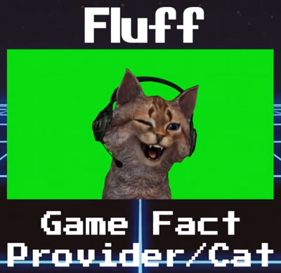
VG101 has a very different vibe from UCBVG. It doesn’t try to be nearly as comprehensive, mostly showing a typical playthough. It doesn’t provide maps or many secrets. But it does have some strategy callouts, mostly provided by their whimsical “TAs,” three side characters who wear silly costumes. The best of these is undoubtedly Fluff, a fairly realistic cat puppet, who lives in a lavish study and smokes a bubble pipe, and who provides interesting trivia about the games being played. It’s worth checking into if you have the time and inclination!
UFO 50 Showcase
For this supersized indie showcase, I took a look at all 50 games from UFO 50.
Editor’s note: This was filed last month, but I didn’t notice it! Please enjoy, presuming you haven’t heard too much UFO 50 yet.

Owner of Game Wisdom with more than a decade of experience writing and talking about game design and the industry. I’m also the author of the “Game Design Deep Dive” series and “20 Essential Games to Study”

