The Graphics of Trap Door and Popeye on the Commodore 64

In my teens I got started coding on my old Commodore 64s. Learning to program was a much different process back then, there was no internet to answer basically any question you’d have almost on a whim, everything I picked up came from some written matter, mostly programmer’s guides (including the definitive guide to using the hardware, the Programmer’s Reference Guide) or periodicals like Compute’s Gazette, Ahoy! and Commodore Magazine.

The C64 had a lot of graphics features, made possible by the machine’s powerful VIC-II chip. All of the home computers of the time had tricks one could use to get extra mileage out of their bespoke graphics hardware. The Atari 8-bit computers had display lists, for instance. The VIC-II had a powerful raster interrupt facility, the ability to share memory with the processor (at the cost of delaying the whole machine while it did so), eight surprisingly large hardware sprites (in double-width mode they could fill a whole scanline, something the NES’ sprites could only dream of doing), and a collection of interesting and flexible graphics modes.

Most of the time the C64 was in character mode, which was the standard kind of tile-based mode that pretty much all home computers at the time used by default, suitable for displaying messages, coding and some graphics. The ’64 three such modes: the standard mode where each character had a single color along with the screen-wide background color; a multicolor mode that gave a character its own color, up to two colors shared throughout the screen and that background color, and (mumble mumble). Sorry, what’d I say? I’ll get to that later.

The system also had two bitmapped modes that worked similarly, just directly viewing a region of memory instead of using each byte as an index into a character set. One mode was like the standard character mode, where the 1s in the bitmap were colored and the 0s were the background color; the other was multicolor mode, which similarly worked like it did in multicolor character mode: one color per 8×8 region, two colors shared throughout the screen, and the background color.

The problem with multicolor mode was, you had to trade horizontal resolution to use it. The big limiting factor to many computers’ graphics then was memory use: finding a way to encode the graphics information so the chip could access it and convert it into a video signal quickly enough to meet the needs of the display. So, to fit an 8-pixel-wide section of screen into the single byte it needed to be squeezed into, it could either use a one-to-one dot to screen ratio, or sacrifice two bits for one extra-wide pixel of up to four possible colors.

UNLESS

The Commodore 64 had a fifth graphics mode. The one I mumbled over earlier. The much-ignored Extended Background Color mode.

It was another character based mode that, instead of forcing you to make use of one background color over the whole screen, gave you up to four such colors. Every cell on the screen could display a character using its full 8×8 resolution, but could also pick which of those background colors it could have. Useful!

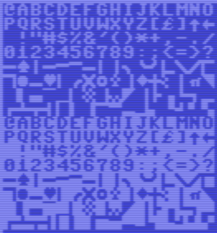
Well… not as useful as you’d think. There’s always a tradeoff, and Extended Background Color’s tradeoff was a dire one. How does the VIC-II chip know which background color to use for each character cell? It uses the two high-order bits of each character byte. Meaning, while you could decide which of two colors would be used in each cell with a lot greater nuance, you only had 64 characters to work with! A full screen of 1,000 characters is a lot to fill with just 64 possible tiles. A lot of repetition would be unavoidable, which is probably why it was so little-used.

It essentially was either this:
or this
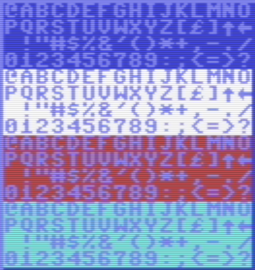
These images are a little misleading, because I used the Commodore 64’s default ROM character set to make them, and the second half of its characters are just mirror images of the first half. But if you define your own characters, which basically any game worth its salt will do, it greatly reduces the number of tiles at your disposal. There may be some sneaky ways around it, sure, but they all involve their own tradeoffs.

I explain all this because Extended Background Color Mode is my best guess as to how Trap Door and Popeye do their graphics.

Here’s video of a playthrough of Popeye. It’s about 21 minutes, but it shouldn’t take long to get what I mean. It’s not Nintendo’s Popeye, it’s a completely different game.

And here’s a playthrough of Trap Door, with graphics by the same person:

Look at those huge characters! How could this be possible, and with that color depth? The C64 can have huge sprites, but only at the cost of making all their dots twice as tall and/or wide. And the pixels aren’t even multicolor mode wide. I can’t quite make sense out of it! Unless, maybe the games are displaying their large characters using the character set, which explains why they jerk along the screen? And the colors are using Extended Background Mode? That might explain the simplicity of the backgrounds, with only 64 characters to work with that means a lot of reused tiles.

I guess the point of this post is: what gives?

Wii to WiiU Data Transfer Animations, Starring Pikmin

This would ordinarily go into a Sundry Sunday post, but it’s interesting for historical value. Unlike the Switch’s spartan interface, the WiiU took some of its UI design inspiration from the 3DS, which was a bit more playful. The 3DS supported theming the main menu, which is a feature that never came to the WiiU, but they both did support StreetPass, with the WiiU still having its little-noticed StreetPass server settings among its rainbow-colored settings menu options. And of course both systems supported the Miiverse, Nintendo’s failed attempt at its own gaming-focused social media service, which let users make text and drawing posts, tied in with their Mii feature (still in the Switch although much declined in prominence), and allowed Nintendo to send users information directly to players. Miiverse is gone now, has been for years, but some people I hear are working on a fan-led revival. I shudder to think of what will get posted there without Nintendo’s moderators.

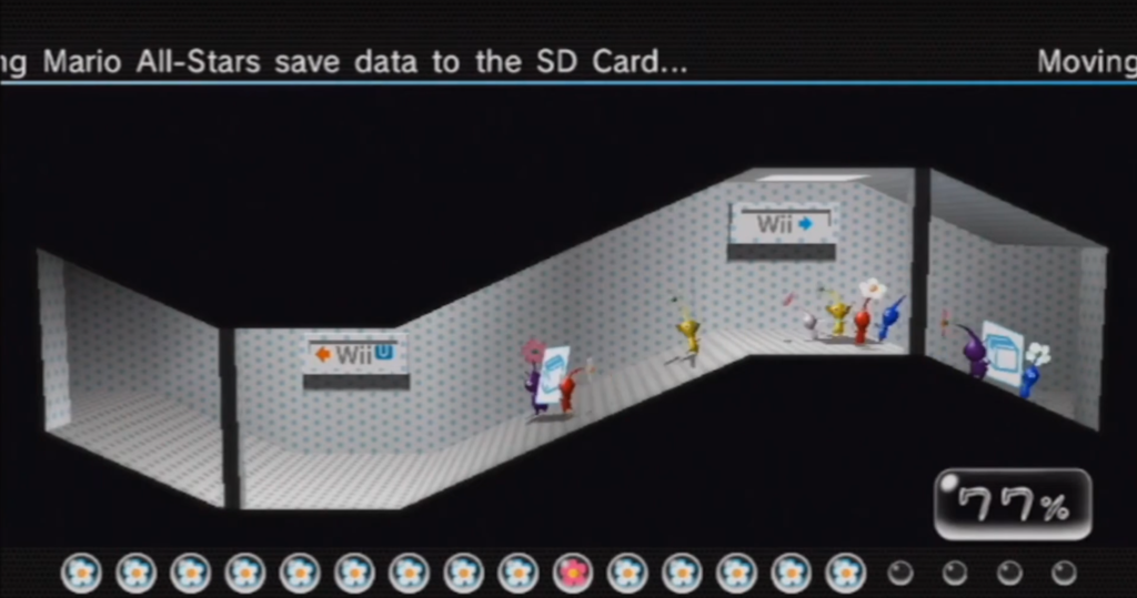
Back to the interface. Probably the quirkiest of Nintendo’s UI creations was an animation that went with the tool, downloaded fro the Wii’s Shop Channel, that transferred system and shop data from the Wii into an SD card package to be transferred to a fresh WiiU system. It could have been a simple progress bar, but they had their developers create a charming (gee I use that word a lot) sequence where Pikmin, at that point only those from the Pikmin 2 game that had last been seen on Gamecube, visually bundle up all of the transferable software, use a walkway to carry it into a waiting rocketship, and jet off to a nearby sun marked with the WiiU logo. At that point, the user would be prompted to move the SD card to the WiiU, where after installing a corresponding tool from the WiiU’s eShop, the process could continue, with a matching unloading animation.

If you never had the chance to see this sequence (easily possible given the WiiU’s low sales), or just want to relive the process, here it is, both of the Wii to WiiU data transfer animations, at about eight minutes:

This video only shows the animation. If you’d rather relive the whole process, including system menus, instructions and warning messages, here is a 15 minute video that records it. It also seems to have a couple of scenes that aren’t in the above video, including the one depicted in the head image.

A brief personal story. When the WiiU came out I got one. The WiiU’s fate was already sealed by that point, and I got it pretty cheap from a local Target. By that time my much-played Wii had been suffering from some serious issues. It had been hacked many times, the Homebrew Channel installed and its boot software replaced.

People will tell you that doing this is only for the purposes of piracy, and that’s really not true. We put the Wii to use as a general media player. It lived mostly at a friend’s house, and whenever I would go over we would use it to watch movies and things from SD cards. We even watched a DVD or two that way; while the Wii had a DVD drive installed, Nintendo didn’t spring for the licenses to play DVD movies, so it was purely intended as a data drive. You could bypass that restriction with the right homebrew software, although it wasn’t great and didn’t seem able to do menus, so we almost never used it.

My Wii had put into heavy use for game and media playing, and I put on and removed a lot of software over time, in addition of course to hacking it several times. As a result, it had gotten quite glitchy. Sometimes it wouldn’t boot, sometimes it would boot okay but wait until getting some ways into a game and freezing, and sometimes, weirdly, it’d show the opening Health warning screen, but the letters in the font would glitch out, individually. It was really a sight to see.

As a result I was really glad to get the saveable data off of that system and onto hardware that was reliable. I had to go through the whole sequence more than once, as the console froze along the way a time or two, but fortunately I got it, and our large Mii collection, all off and onto the WiiU, where it still lives today.

Collecting and saving Miis, from friends and the nearly-forgotten Check Mii Out Channel, and the Mii Parade of random Miis sent from Nintendo, is an aspect of the Wii that has not survived to the Switch. I hope whatever successor the Switch gets has something like it. And bring back StreetPass too!

Wii to Wii U Data Transfer w/ Pikmin (Youtube, 8 minutes)

Favorite Games of Ludanarracon 2023

From Ludonarracon 2023, this is a demo showcase of all the games I’ve played during the show.

0:00 Intro
00:20 Cryptmaster
2:08 Tamarindos Freaking Dinner
4:12 Demonschool
6:29 The Invincible
8:12 Sucker for Love A Date to Die For
10:03 Kitsune The Journey of Adashino
11:24 Astronaut the best
13:29 Loco Motive
15:54 Slay the Princess
17:47 Do Not Feed the Monkeys 2099
18:56 Forever Lost
20:35 Times & Galaxy
22:35 The Star Named EOS
24:08 Stray Gods
25:31 Dead Pets Unleashed
27:05 Roadwarden
28:51 1000X Resist
30:34 Harmony the Fall of Reverie

On Finding and Preserving Discord and Youtube

This editorial doesn’t necessarily reflect the views of this blog. However, blogs don’t have views anyway, so what would that even mean?

This is a slightly edited version of a diatribe I emitted on mefi.social. I really want people to see it and think about what it means though.

A dismaying thing is how much of current gaming culture is locked behind Discords, and/or is revealed to the world only through Youtube videos.

These two phenomena are the result of the Myth of the Benevolent Corporation, which was largely started by early Google and their “Do No Evil” policy, which sustained the early web for a good while but itself did huge damage to online culture, and yet promises to do much much more, when they decided that profits mattered more.

When Youtube started, everyone saw it as a kind of miracle. In the early days videos were limited to 10 minutes, but even so they began attracting a huge amount of material. When they switch to just letting people upload anything for free, that exploded.

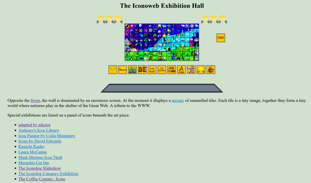
I love this page, at http://cs.gettysburg.edu/~duncjo01/archive/icons/iconolog/pavilion/iconHall.html. I’m really sad that the world depicted within has shrunken so much, and of the list of links on this page only three survive.

It’s not just gaming stuff that I’m talking about really, although as a popular fixation for people it’s kind of a hint of things to come. Lots of information is currently exposed to the world through Youtube videos and minidocs.

From U Can Beat Videogames’s video on Shadowrun. It’s great, but some day it’ll be gone. How will people beat an ancient obscure SNES game like this then?

But Youtube has always been a time bomb for all this content. It’s inevitable that Youtube will someday begin deleting things. If not sooner, then later. Yet there are few entities capable of preserving all of it, or even most of it. All of this will [get destroyed] like [crying] in [a downpour].

Of course, it’s not like videos like these have any other hope as it stands. A collection of the incredible size of Youtube’s is so big that only a government could realistically do it, and most of those have their own issues when it comes to continuity of mission and funding.

But combined with Discords as a means of communication, and (bizarrely) information, a lot of online culture is currently a black box to outsiders, unless they sign up to dozens of miscellaneous Discords. And there is a limit to the number of servers you can follow, which is reputed to be 100. (It used to be that Google could get you a quick answer to a question like how many Discord servers can one user follow, but now I’m not sure.)

Social media companies, who all seem to be racing each other to make their services as crappy as possible to non-paying users, are no solution either.

There used to be a Mastodon search engine, at search.noc.social. This is what remains of it. (Yes, it’s just a white page with the text “project has been removed.”)

Fediverse to the rescue! But no, a lot of it is transitory, sometimes intentionally so! In some circles even suggesting that Mastodon be just searchable, let alone preservable, will subject you to a storm of criticism. It’s true that being opaque to general search helps protect vulnerable users, a noble cause, but it also makes Mastodon’s discoverability very low. (One solution, which I think I mentioned here before, is an opt-in search solution called tootfinder, but it currently only goes back three months.)

And I don’t see many other people talking about this, even though the sudden decay of Twitter and Reddit has made this essential problem more visible than its been for a long time.

I feel like going onto every Discord I follow, gaming research ones in particular, and ringing alarm bells, but it’s a task just to find them out, and really what good would it do. People use Discord because it’s free and easy and they even maintain the server for you. These kinds of spaces have always relied on some patron to uphold them; the only real differences are before they were visible to search and the Wayback Machine, and now, it’s a single company that will increasingly hold access to these places obscured behind a storm of pleas to subscribe to Nitro, and someday will delete them entirely.

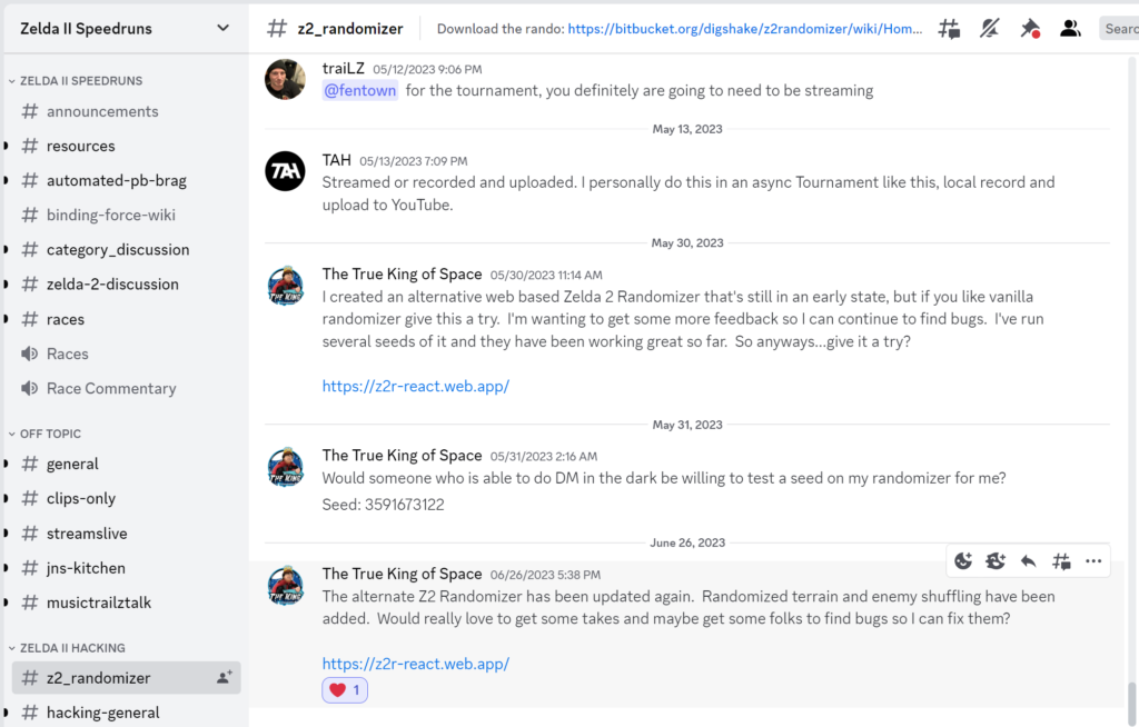
The Zelda II Randomizer Discord. As a community, it works okay. As a way of storing information, well, it sucks rocks. As a way of preserving everything, it’s DOOOOOMED.

If you think I’m being hyperbolic, there are vast swaths of online culture that are already lost permanently: the Compuserve forums of the era immediately preceding the rise of the web. Compuserve was once the biggest online presence. And AOL, which grew to eclipse it in size, likewise holds (still? I don’t know, it’s on AOL!) a vast amount of early internet culture.

Newsgroup archives are a bit better off because of their openness, although nowadays it’s mostly seen as just a way to enable piracy.

Still, essential web services are at least preservable. The Fediverse resembles those, at least in principle, so it’s immediately better off than Discords and Youtube, for making old information findable, even if it’s currently really hard to do it (and some people are outright opposed to it).

It is time to wrap this all up. I say things like this frequently these days. Maybe someday someone will listen. The power and reach of the internet doesn’t have to rely on big companies. I also have qualms about the ability of a even a horde of individual servers to keep things going, mind you. All those dead links on all those surviving old websites, they once represented living projects too.

I think what we ultimately need is an independent organization that can keep up old sites and communities, and provide a place for new ones, maybe supported by donations, without the explicit profit motive of the bigcorps. Something that looks like the Internet Archive or Wikipedia. There’s places where you can host plain websites even today, like the Tildeverse (but its individual pieces, like Fediverse servers, always feel like they could vanish at any time), ancient-yet-still-here Angelfire (of which, like the Lycos it’s a part of, it’s amazing still survives), or the newer, enthusiast-focused Neocities (which too has no guarantee of longevity).

Companies can live longer than people, or their interest cycles. It doesn’t feel right that something like a website require someone to dedicate their life to maintaining it, but due to the dysfunctional way our economic has come to see companies (involving the hateful words fiduciary duty) are also vulnerable to the winds of change. It feels like a non-profit, or at least a durable privately-held company that isn’t pushed by rapacious groups to chase every profit lead no matter how disastrous, may be a solution. I don’t know if it really is, though. I’m just watching this, mostly from the outside. I hope someone can do something though, to overturn the cold tides of entropy. I really do.

Oldweb: DHTML Lemmings

The World Wide Web is now over thirty years old. In that time, more content has vanished from it than remains now, but some of it can still be dredged up from the shadowy archives of the Wayback Machine. This is the latest chapter in our never-ending search to find the cool gaming stuff that time forgot….

DHTML means “Dynamic Hypertext Markup Language.” The term is little-used now; it later got renamed AJAX, and now is pretty much just how websites are made if they have any interactive aspects. It was originally presented as an alternative to Flash applets, which were threatening to crowd out actual web pages at that time.

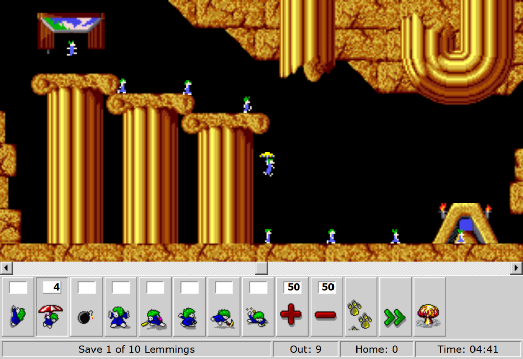
Lemmings, of course, is Psygnosis’ classic puzzle game where you grant members of a horde of suicidal rodent people specific skills to guide them to an exit while losing as few of them as possible to the hazards of their ridiculously dangerous world.

Back in 2004, DHTML Lemmings was a brilliant example of how much could be done with Javascript. Original Lemmings was released in 1991; we’re now further away from DHTML Lemming’s release than the original game was when it was published.

Its first home went away, although the server and even its page still exist. It says that the Lemmings page was taken down (and implies they did it to dodge legal liability), but promises something called The Pumpkins to replace it. It never did, but the promise survives. The game itself has been preserved, relocated as-was to a subpage of the site of Elizium, a dark rock band from the Netherlands.

Only the first ten levels of each difficulty, about one quarter of the original Amiga game, are presented. And this version has not survived the years unaltered: the distinctive sound effects and music appear to be missing. Still though, what’s here is playable, and fun. Enjoy, if you have the inclination and deliberation. And check out those requirements: IE 5.5 or better, or recent Firefox or Opera. And a 500 Mhz processor, wow!

DHTML Lemmings

The Emergent Design of Scholar of the Arcane Arts

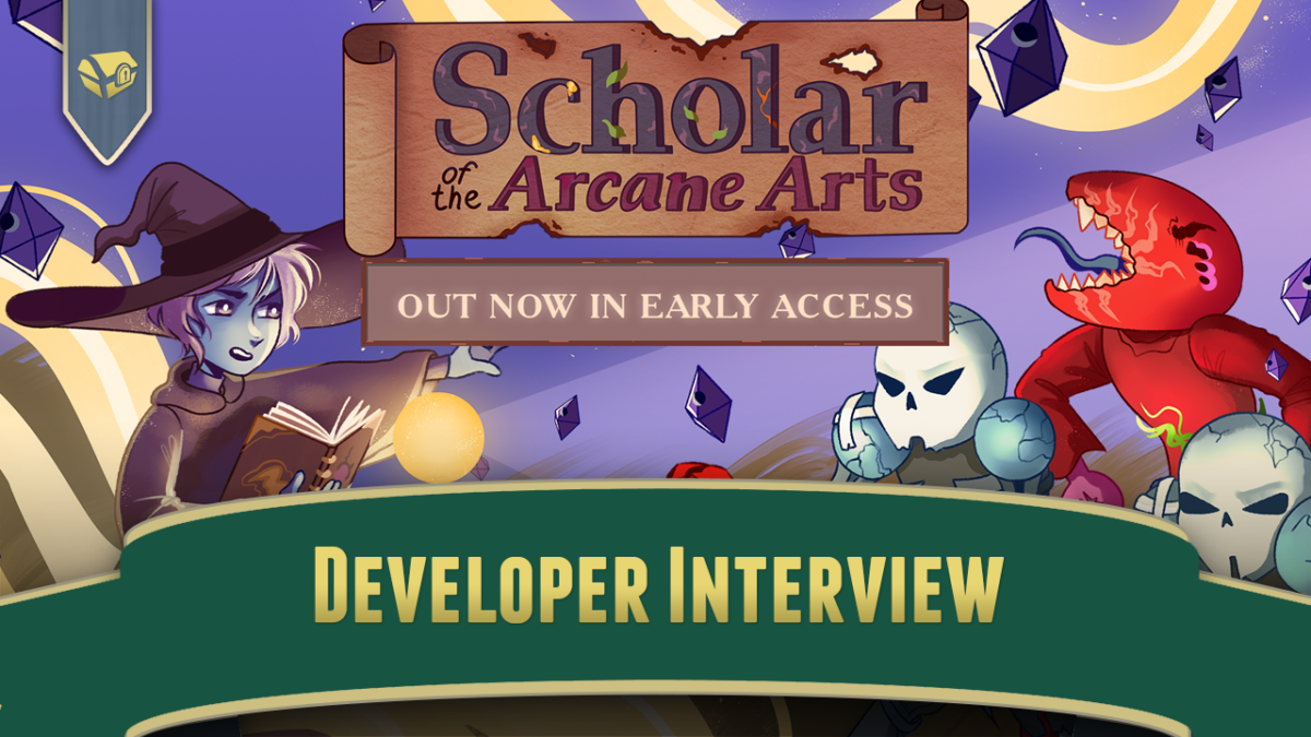
For this developer interview on the Perceptive Podcast, I spoke with Endo who for their first indie dev game is working on Scholar of the Arcane Arts, a game that combines roguelike and emergent design. We spoke about what it’s like designing a high-level concept, learning game dev for the first time, and the balancing considerations of trying not to go overboard in terms of game design.

Sundry Sunday: Brooklyn Nine-Nine, But It’s Sonic

Sundry Sunday is our weekly feature of fun gaming culture finds and videos, from across the years and even decades.

A while back we posted Community, But Sonic, a fun little Youtoon from frequent Sundry Sunday appearator Pringus McDingus, of Sonic characters animated to audio from Community.

Along those same lines, here’s an animated storyboard of Sonic characters aniedited to fit Brooklyn Nine-Nine audio, from Doig & Swift. (Words in italics may not have actuality.)

The works of GAMEDESIGN & SKIPMORE

The Japanese person (or people) behind the website www.gamedesign.jp are mysterious to me. I know nothing about them, except that they’ve been making games, first in Flash, then more recently using the Ruffle runtime, since at least 2001.

DICEWARS

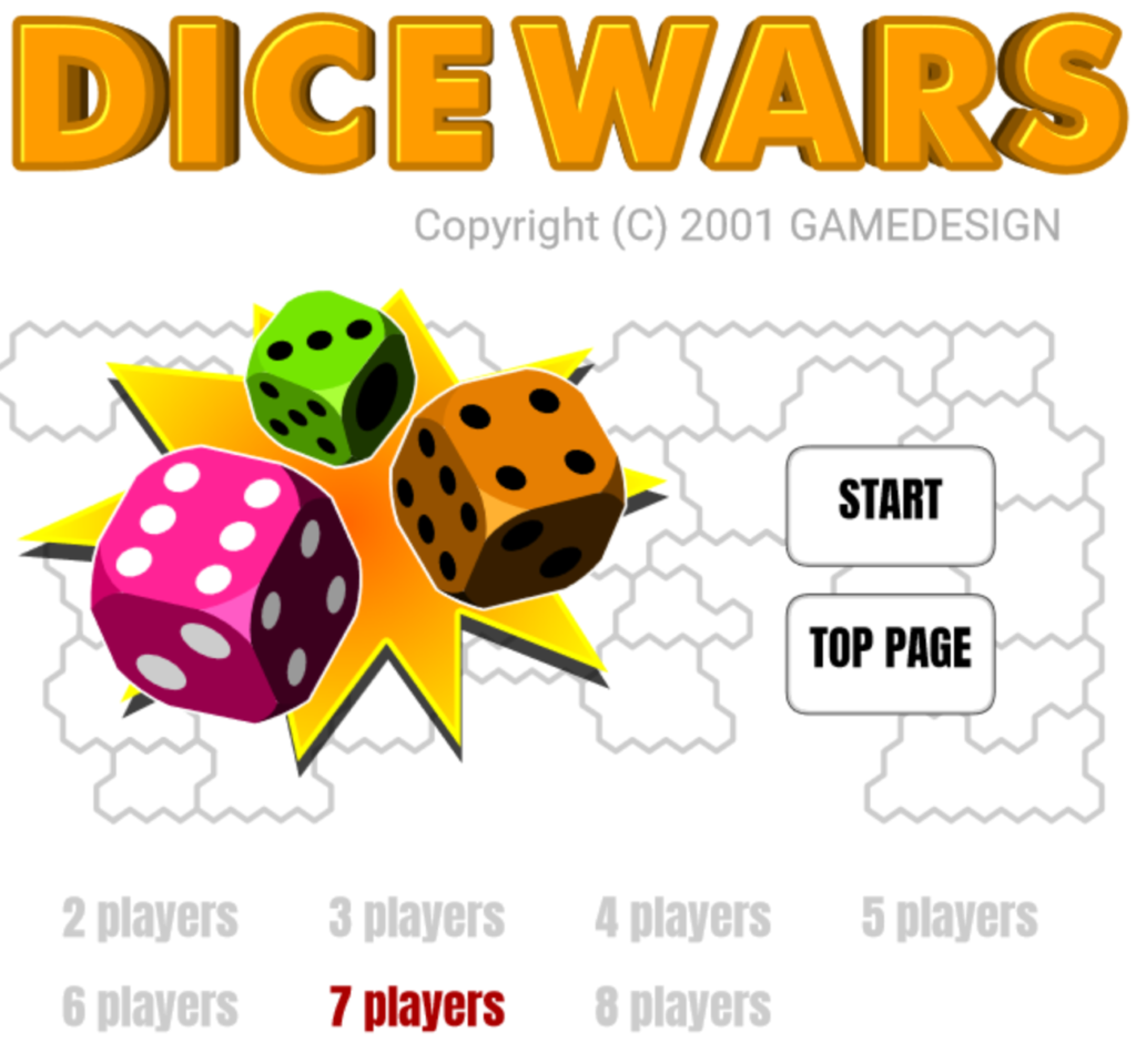
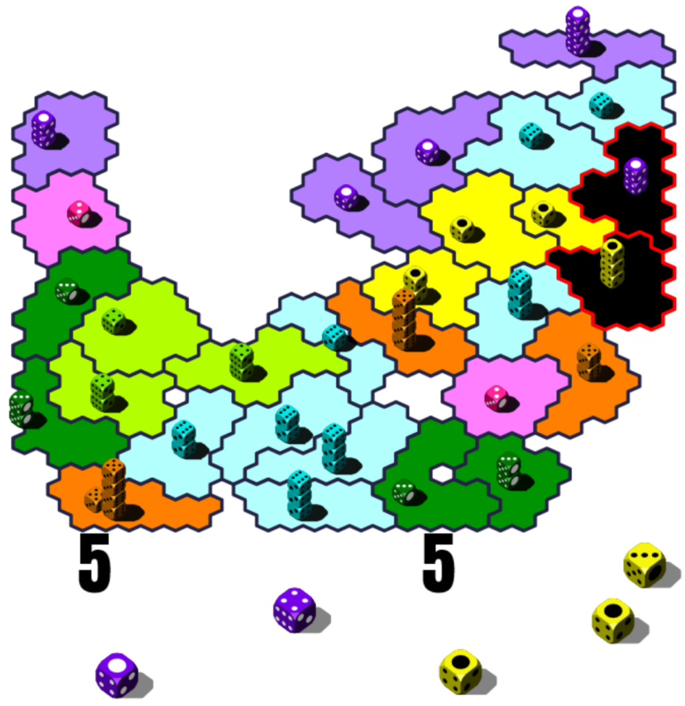
While the title under which they put up their efforts may not be memorable, if you’ve been playing web games for a while you probably know some of their work. Possibly their best-known game is DICEWARS, which is like a version of Risk that plays much much faster, most games over in minutes, instead, as with the people I know who have played it, of days.

In DICEWARS (several of GAMEDESIGN’s games are stylized with allcaps), you have nation whose territories are represented as colored areas, each containing a stack of from one to eight six-sided dice. Each nation gets a turn to act, during which they can use a stack of dice to attack the dice of a neighboring country. Fights are resolved by rolling all of the dice in the two stacks. If the attacker wins, they move all of their stack save one into their conquest and take over (the enemy dice are lost), with that single die remaining in the stack’s previous home to keep the lights on.

If the defender rolls higher, or there’s a tie, the attacker loses all of their dice in the stack except one and the defender loses nothing. A stack of one can’t attack, and is generally pretty easy to slaughter by other nations; a good element of strategy is figuring out how to keep high-dice stacks near the front, between enemies and your single-die lands, since you can’t manually move dice around between your territories. When a nation is done acting for a turn, they receive extra bonus dice relative, I think, to the largest contiguous group of regions they control. They are placed randomly among all their possessions.

Fairune (Flash version)

Various versions of DICEWARS can be found on mobile app stores, although I don’t think any of them are officially blessed, and they tend to disappear after awhile.

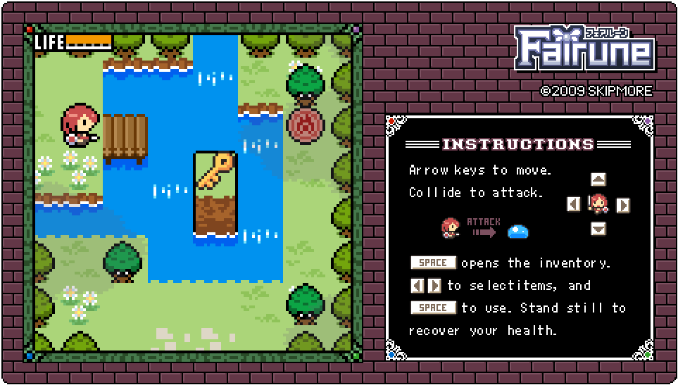
It turns out they have a lot of other games that you may know of. One of particular note is Fairune, which is a capsule, very much simplified JRPG. Fairune and sequels made it to the 3DS and Switch eShops, where they are very inexpensive and enjoyable. Fairune is copyrighted by SKIPMORE, which may be a different entity. It’s still a nice game, worth looking into.

EDIT: SKIPMORE has their own website, which now mostly presents their downloadable console and mobile games.

The works of GAMEDESIGN (www.gamedesign.jp)

Identifying Luck in Mario Party 7

ZoomZike on Youtube has been working for years on a comprehensive series of videos going through all the Mario Party games, and breaking down what parts of each are a matter of luck, and how many are of skill. Along the way, they also serve as fine guides to winning at them, at least as far as you are able.

They’ve gone through the series, trending longer with each one, for each game from Mario Party 1 through 7 (with an April Fool’s stop over at Advance). Even the shortest is at least an hour, and the most recent one is over five hours. That might seem like a whole lot, but imagine how long it took to construct! These are really deep videos, often with odds figured out through exhaustive, and exhausting, trial and error.

Mario Party 7 is the last of the four Mario Party games that came out for the Gamecube, even beating out the N64 portion of the series by one game. The early MPs were notorious controller destroyers, often resulting in the dreaded white dust of death, a result of ground plastic, emerging from the controller after heavy play. The Gamecube had controllers that weren’t as susceptible to wearing out, and so were better suited for the demanding play that Mario Party provides.

Anyway, here is the video, all five hours and 25 minutes of it:

And, here is the direct link:

Identifying Luck in Mario Party 7 (Youtube, 5:15)

Romhack Thursday: The Legend of Zelda for SNES

On Romhack Thursdays, we bring you interesting finds from the world of game modifications.

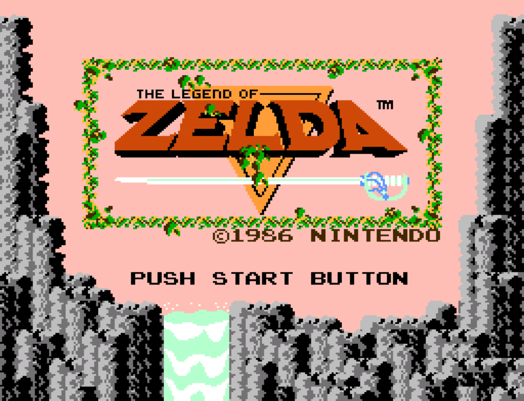
It’s not easy to find romhacks that measure up to our exacting standards, that strike me in just “that way,” but a conversion of the NES Legend of Zelda, one of the few mainline Zeldas never to have been really remade in any form (unless you count the abandoned Satellaview versions), fits the bill like a duck in well-made dentures.

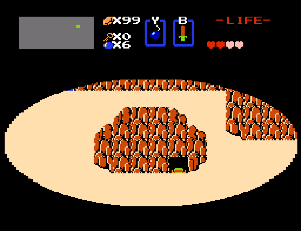
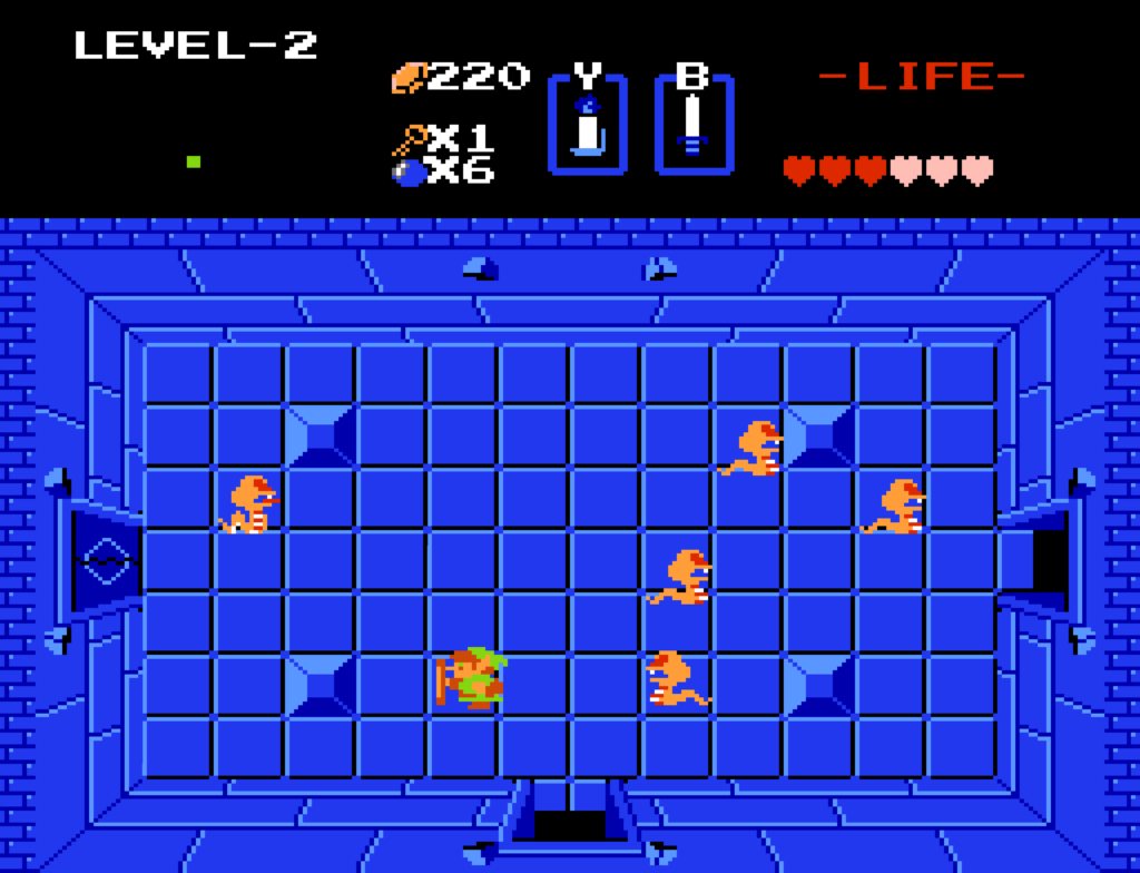
This screenshot may look nearly exactly like The Legend of Zelda. In fact it is the Legend of Zelda, just converted, nearly exactly, to the SNES.

Link doesn’t wait for the transition to finish to start climbing out of caves.

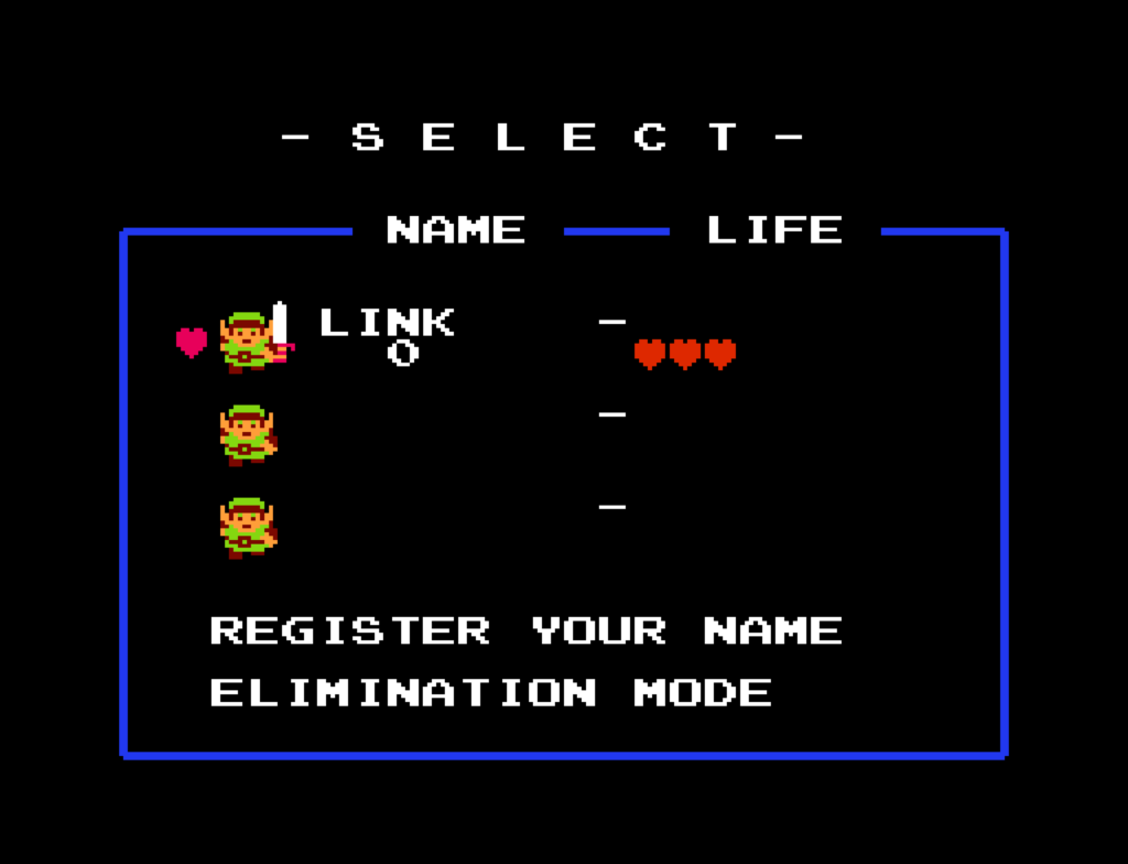
The question has to be asked: why? I mean, to a degree it is kind of pointless. There’s been nearly exact (although always unofficial) re-implementations of The Original The Legend of Zelda since Zelda Classic (Set Side B). All of Nintendo’s own rereleases, from Virtual Console to Gamecube bonus disks to a stand-alone Game & Watch unit. But recreating it on SNES does have certain uses. First, it fixes a handful of issues with the earlier game, notably it doesn’t have flicker or slowdown. It also uses the L and R buttons to allow for quick inventory cycling without having to go into the subscreen.

The colors are slightly better as well. And the top of the screen display labels the buttons Y and B, instead of B and A.

It speeds up game transitions: it uses the Link to the Past-style iris in and out effects, using the SNES’ display masking feature, instead of the slower curtain closes and opens from the NES version. It allows you to use custom soundtracks via MSU-1 support. Health refills instantly instead of pausing the game for up to 15 seconds while all your hearts load up with red. And the sound is very slightly different: by default the low-health beep is less insistent, there’s an extra sound when you kill an enemy, and the candle sound is a little higher in pitch.

But perhaps the best reason to convert it to the SNES is, SNES emulators are nearly as common as NES emulators. You can play this modestly improves version of LoZ on anything with an SNES emulator, which isn’t something you can say of Zelda Classic.

Yes, I used this hack as an excuse to play completely through the first quest again. And yes, I did it without dying. I still got it.

I’m kind of an outspoken fan of the original LoZ, I still think it’s well worth playing today, although I think you should seek out its manual should you do so. (The opening demo even tells you to look there for details!) You’ll die a lot, it’s true, but there’s little penalty for it except for going back to start or the beginning of a dungeon, and having to go refill your health before you try again. It takes real skill to weave around its fast-moving enemies and projectiles, but it’s doable, and you don’t need speedrun skillz to do it.

It is rather difficult to find it through search. It’s not on romhacking.net. Creator infidelity’s announcement was on Twitter, where he offered only a direct download.

Here’s Wes Fenlon’s post enthusing over the port. And here’s where it can be obtained, although links to previous versions have been disabled, so this one may be too if it receives another update.

From Destructoid: Gex Recriminations

The Suck Fairy is a mischievous spirit who visits the beloved properties of our youths so that when we return to them they’re much worse than they were when we first found them. That is surely the explanation; it’s not that we’re much more knowledgeable and mature readers/viewers/players now than back then. It can’t be that our horizons have expanded. It can’t be that the thing we liked back then was never really as good as we thought it was.

The Suck Fairy as a concept has been with us for a while now. I think it was introduced to the world in a September 2010 article on Tor.com by Jo Walton. There’s lots of weird concepts like that that litter internet culture (my favorite is the “Crazification Factor,” from a post on Kung Fu Monkey in 2005, long enough ago that its mention of Obama’s election refers to his Senate run), and sometimes we don’t even know the first time it arose.

Gek is maybe an odd choice for a visit from the Suck Fairy; surely, all of its suck was predispensed? But it was still beloved by some, many of them purchasers of the failed 3DO system on which it originated, one of those consoles with few games, and even fewer that could be called good. (The best, probably? Star Control II.)

The writer of this Destructoid article, still liked it for itself, but finds that it’s one of those games where context given by its manual kind of ruins the game’s premise by giving it an adverse context.

If you just play the game, Gex is a fairly shallow game about a lizard mascot character, in sunglasses no less, romping through a series of worlds based on media properties, uttering trite digitized quotes at various times.

If you read the manual, you find out that Gex is wallowing in sorrow! His dad was an astrogecko working for NASA! He lost his life in a terrible accident! Gex, unable to face the world, retreated into television! It’s the only way he can handle living! And, although Gex thwarts the villain’s plot to use him as a mascot character (a thing he already is really), nothing at the end of the game indicates that his mental state has changed.

The first of six manual pages that lays out the reason for Gex’s media obsession.

I think the writer may be overthinking things a bit. Often manual stories were written as an afterthought by people who had nothing to do with the making of the game. Have you ever seen the manual for the NES release of Konami’s Life Force? It claims that the evil gigantic space creature Zelos, huge enough to devour planets, was the proud offspring of alien beings named “Ma and Pa Deltoid.” The manual for NES Metal Gear claims that the villain wasn’t Big Boss but instead “Colonel Vermon CaTaffy.”

Gex got off pretty lightly, by comparison.

I’ve wildly misunderstood Gex (Destructoid, by Timothy Monbleau)

Ski-Free But You Play As The Yeti

Ski-Free is a beloved part of casual gaming from the days before it was called that, before even internet use was widespread. Distributed as part of Microsoft Entertainment Pack 3, it predates even Windows 95, and even Windows 3.1! It goes all the way back to Windows 3.0. Checking up on the game in Wikipedia reveals that a version of it is included as an easter egg in current Microsoft Edge (go to edge://surf in that browser, if for some reason you use it).

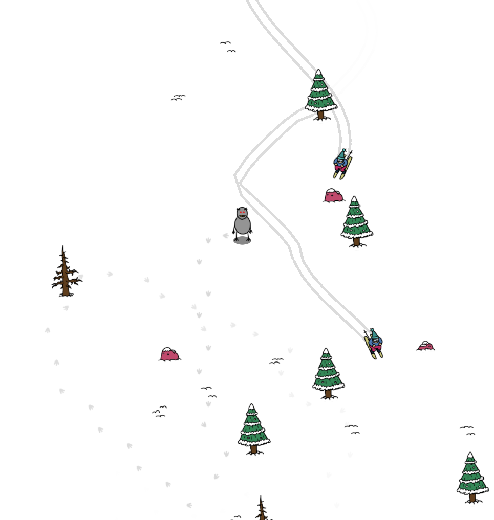
One of the most remembered things about Ski Free is, if you get to the end of the course and keep going, eventually a yeti will chase your skiier down and eat him. A submission to GMTK 2023 gamejam, Yeti Upsetti is Ski Free in reverse. You play as the yeti, and try to chase down skiiers. You can run in all directions, but even so it’s very difficult to catch any of those elusive sportspeople. They’re very good at avoiding your abominable grasp. The only strategy that has worked for me at all is trying to chase them into obstacles, which gives you two short seconds to grab them for a monsterly meal before they get back on their skiis and coast away. Except to be told many times that you’ve died of starvation, and that you’re a terrible yeti. Which, fair, I don’t live anywhere near a snow-covered mountainside in real life.

Yeti Upsetti (itch.io, $0)